The Future of Design is Still Personal: Reaching Toward True Adaptation
If the people who we now call “users” could derive their own experiences by expressing their intention, how radically different could our work, as designers of all types, be?
The discipline of design has historically produced fixed products. Even the term "product" implies the end of a process, or something that is completed and typically unchanging. But we know that the intent of the designer and of the person experiencing the design are engaged in an ongoing conversation. Digital products have drastically increased the pace of that conversation, introducing faster iteration, new modes of interaction, and – importantly – space to imagine a future in which a person's intent directly defines their experience of digital interfaces. This essay connects historic conceptions of interface and adaptable design with contemporary developments and visions, looking toward a truly adaptive future that transforms “users” into individual creators by directly enabling the expression of their intent.

How many times have you seen an image that describes the experience of a UX designer?
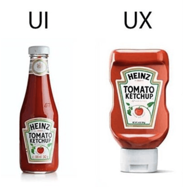
Is ketchup the best metaphor?
The image that has probably been the most pervasive, vacillating between ironic and earnest at various moments, is that of two bottles of ketchup. On the left, there’s a glass bottle that stands upright with a metal screw top lid. The kind of bottle you have to hit with an open palm or stick a knife in to “get things going.” But, the image implies, it’s aesthetically nice. It stands for the type of design that looks nice, regardless of its impact on our experience - there is an implicit value statement in the image that this bottle, helpfully labeled “UI” is mostly concerned with visuals and sacrifices all else.
On the right, a plastic bottle with the lid facing down. This one squirts, and gravity helps the ketchup stay near the opening. The lid is even bigger for better balance. It is, ostensibly – given the label “UX” – a bottle whose primary concern is ease of use, a good experience, and more ketchup. The image of course can’t illustrate that this bottle you still need to shake beforehand, will probably fall over at some point, gets crusty around the opening, and is made of single-use plastic that is, in all likelihood, going to be dumped in the ocean.
What does this mean, actually?
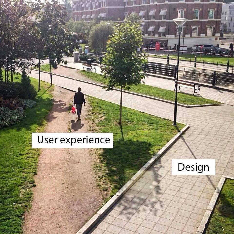
Then there’s the “desire path” image, showing a well-trod dirt path cutting through grass next to a perfectly maintained sidewalk. The sidewalk is instructively labeled “design,” again aesthetic, full of visual function and meaning, clearly representing a design intent, and the desire path is labeled “User Experience.” This image, too, is loaded with implicit beliefs. The desire path would tell us that perhaps a designer should have made a diagonal sidewalk instead of a perpendicular one, or perhaps that user experience really means that the user will do whatever they want to accomplish a task, no matter how carefully we’ve placed our bricks on the path.
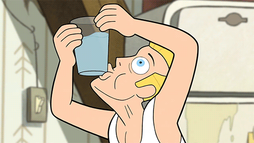
It’s worth considering that this gif was clipped from an episode of the show Gravity Falls in which the men pictured are revealed to be imprisoned clones.
Finally, though I’m sure this isn’t the last image that comes to mind, there’s the gif of a guy with a glass of water who can’t seem to take a drink¹ - a straightforward task like drinking water is made to look impossible even though to us, as viewers, the answer is right there. If we’re viewing as designers, we see that someone has designed a glass for holding water and putting it to your mouth, and we give a knowing chuckle to the representation of a user who just can’t figure it out.
These images feel relatable to us at different stages of the design process, and can provide some much needed comic relief, but they share another common factor with one another: they frame the intent and context of the user as an aberration, something to be worked around, to predict and influence, to standardize or, in the worst case, to ignore.
If these images are any kind of touchstones for our understanding of our discipline, we can probably use them for some critical reflection, too. Our work creating interfaces doesn’t typically deal with ketchup bottles, sidewalks, or glasses of water. The technology we use to implement an interface is digital. The metaphorical ketchup bottle we’re producing doesn’t even have to have a fixed shape – ours is customizable. Its shape, color, size, elevation, placement, are all easily changeable. Likewise our sidewalks can be reconfigured for specific use-cases or tasks. A trail through nearby grass shouldn’t be a problem or an interesting side-effect, it should be something we welcome and facilitate. Why can’t someone drink out of the bottom of a glass of water, when the glass itself is virtual?
If we imagine this happening in actual space it sounds a little outlandish. We understand these objects to be the fixed result of a process of production. Even the word “product,” which we certainly use to describe our work as designers and developers, implies something that is produced, something lying at the end of a process rather than in the middle or the beginning or somewhere totally outside a process of creation as we would currently conceive it. As such, most products are resistant to change. They’re inflexible; their properties are unbending; put simply, they can’t adapt.

Ketchup rolls along a mass-production line.
Mass Production
Many if not most products we encounter today are also understood to be the result of mass production, a process that owes its speed and efficiency to the standardization of the objects it produces. To make a new type of ketchup bottle, you need new molds for glass or plastic, new designs, machined parts that can precisely reproduce the bottle over and over again. Over time, incremental improvements are made in response to material costs, manufacturing processes, customer response, and aesthetic trends. That is to say, all products are the outcome of a conversation between a creator and a person experiencing the creation. But most people will be using the same ketchup bottle for a long time before a new one comes along.
With the advent of digital or virtual products – that is products that are reproduced with low-level materials like electricity rather than higher level physical materials like glass or concrete – the pace of this conversation has quickened significantly, and has the ability to become more dimensional and inclusive than before. As people making products for a digital platform, we have an unprecedented ability to iterate on ideas and change products over and over again, fine-tuning them to match our goals and the goals of our users. Despite this, we are still essentially manufacturing new ketchup bottles really really really fast, rather than changing something in the fundamental discipline of I guess, in this metaphor, containing and dispensing ketchup; something that would provide the basic capability of dispensing ketchup, but leave the details – grip, volume, weight, shape, color – up to each person’s own realities. Keller Easterling, in a discussion of her book, Extrastatecraft put it best:
“You don’t square up to every weed in this field with a righteous fight; you change something in the soil.” ²
Our collective gaze in designing digital products is fixed on systems, standardization, and the notion of “best practices” to solve problems. We have a set of tools that we continually apply to what is, fundamentally, an immeasurably nuanced set of questions and needs. When we finish using the tools, we distribute linear updates. In other words, we, too, practice mass production, and address each weed in the field with incremental improvements. In actual application of our practice, it isn’t the conversation that’s gotten faster – it’s just the distribution.
And as we push more updates, we create more products. And these responses to the externalities I mentioned before can only happen in aggregate because we are only shipping one app or product at a time. An aggregate approach means that, in all likelihood, no one thing is designed specifically for any one person.
On the other side of things, as people called “users,” we find ourselves trying to find and fit into workflows, developing new intentions in order to satisfy our existing ones by “learning” to use interfaces, keeping up with abstract patterns like navigation or gesture controls. This experience is especially acute for people who haven’t been included in the evolution of interface design, or who might be encountering these kinds of interfaces for the first time.
As a response to this, in 2015 and 2016 when I began working on Project Phoebe, which was my first foray into imagining other futures for our discipline, I discussed the need for digital interfaces to make themselves prolific, becoming what each person needs rather than what an aggregate of many people may need.
I want to revise that approach by adding that interfaces should be based not only on individual needs but also intentions - those that are, crucially, not the ones established by designers. Interfaces should follow rather than shape the needs and intentions of the user. The process of moving toward this goal will fundamentally transform our approach to designing interfaces.
The shifting role of design
But let’s catch our breath and consider how we talk about our work for a moment. For the designers reading this, some of us may consider ourselves to be “product designers,” the creators of products which, as we discussed, lie at the end of a process. We “design” the results of that process, crafting a path to reach them and a product that can, ultimately, reproduce that path for other people. Some of us prefer the term “UX designer,” and we are the creators of something that is experienced by users, or experienced through use. We can also be “UI designers,” who build the substrate interface upon which the product can reproduce its results. Still others are “interaction designers,” and we say that we are “creating” interactions that people can execute with our digital objects, invisibly guiding their eyes, hands, and thoughts as an architect might conceive of guiding a body through space. Within and without these categories there are numerous other specializations and generalizations, but the semantics of our titles are not important.
In all these scenarios, we are operating with a mentality shaped by the received knowledge of our industry, which is itself shaped by the received knowledge of the capitalist organization of our economies. The mentality is one that relies on the idea, mentioned earlier, that user intent is something that needs to be predicted, documented, worked around and, most insidiously, influenced by the product makers; it’s an approach that sees consumption - rather than creation - as a primary mode of experiencing the world, and this is starkly reflected in our work.
To begin to break our discipline out of this rut, consider what it might be like if the people who we now call “users,” were instead “creators.” If the people who are now expected to passively experience and consume a product, dutifully reproducing results designed by our intention, actually could derive their own experiences by expressing their intention. How radically different could our work, as designers of all types, be?
Let’s explore that.
What is “interface?”
In a SPAN 2015 session called The Interface³, architectural historian John Harwood discussed the history of chair design as a means of understanding the object/subject relationship between people and the objects that govern our experiences of the world. The talk began with Marcel Breuer, a modernist architect with a prolific portfolio of furniture produced during his time at the Bauhaus.
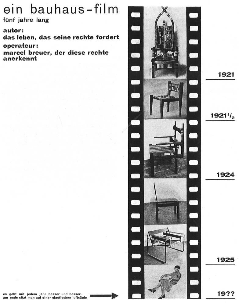
Breuer’s 1926 reflection on the future of (furniture) design.
Breuer understood the peculiarity of the dynamic between creator and experiencer, illustrating in a 1926 poster⁴ that “[chair design] gets better and better every year. In the end, one sits on an elastic air column.” The humor of imagining that what we consider a “chair” will be transformed into something that is indeed so elastic that it no longer physically exists must stand side-by-side with the lived experience of all chair-sitters that actually, chairs are often not that comfortable, and that one chair has difficulty supporting multiple needs.
Photos by @whoishaleylawrence, @xcrap, and @sweetspotphoto on Unsplash
Even if it’s great for one purpose like seating many people at an event, or fitting into a corner, or looking great on the patio, it might not support you after a long hike, or hold you and your child as you read a book together, or survive bad weather. An invisible, elastic air column really doesn’t sound so bad.

“Interface” is a dance.
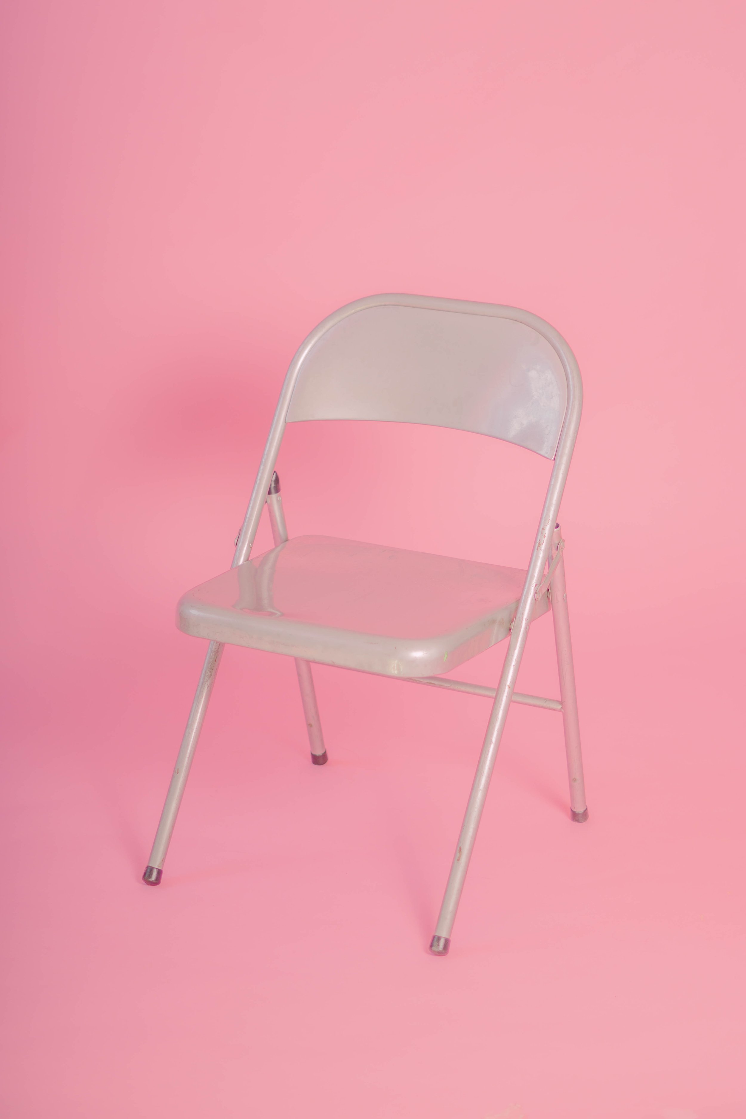
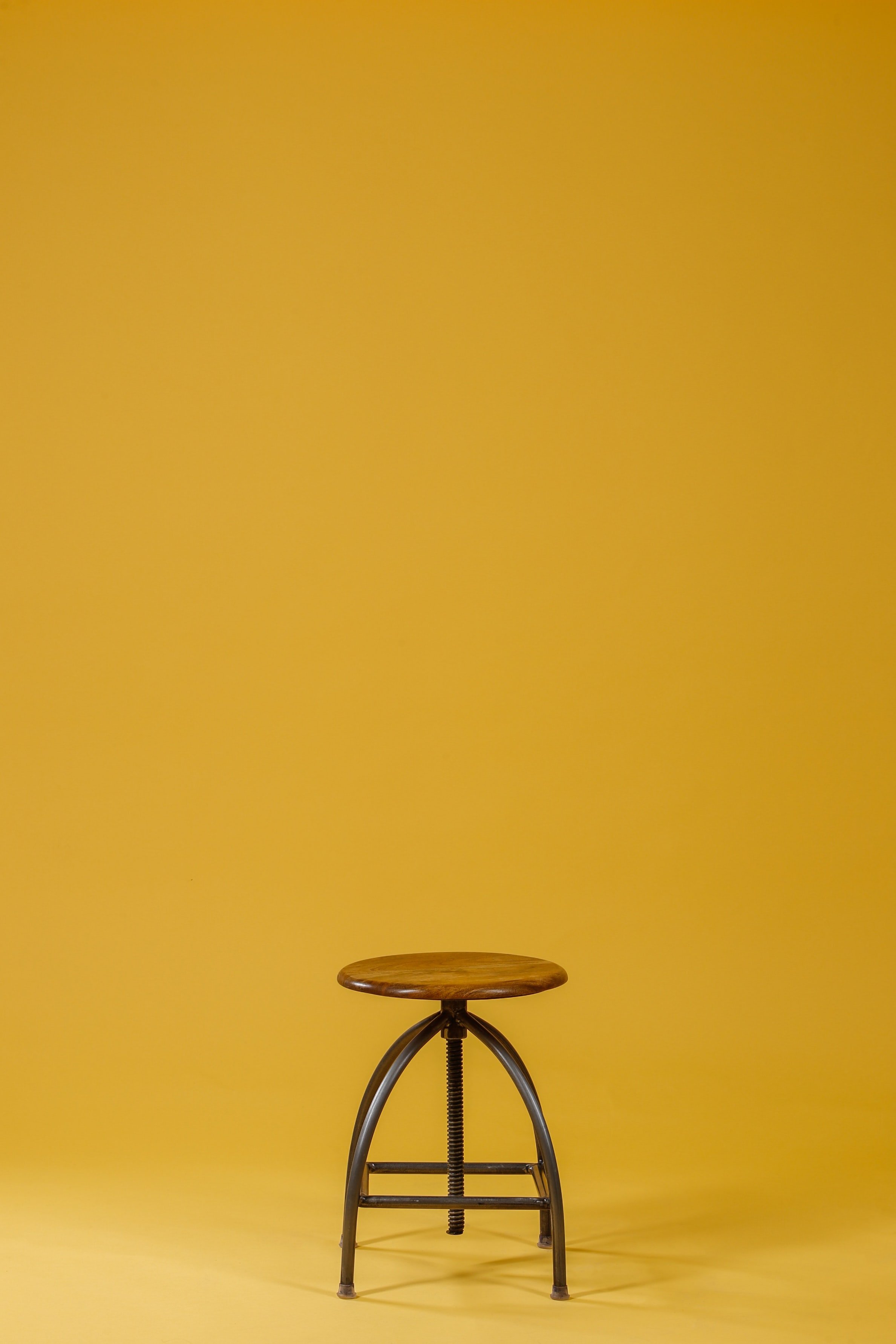
This example underscores that the concept of “interface,” as a description of the dance between subject and object – between human and technology – has been floating around for a long time. The chair was understood by Breuer and others to be one interface – something nominally, if not practically, designed with a human in mind, but ultimately, as a static object, exerting its own object will on the person who ends up sitting in it.
Photos by @fesh00, @octadan, and @charlesdeluvio on Unsplash
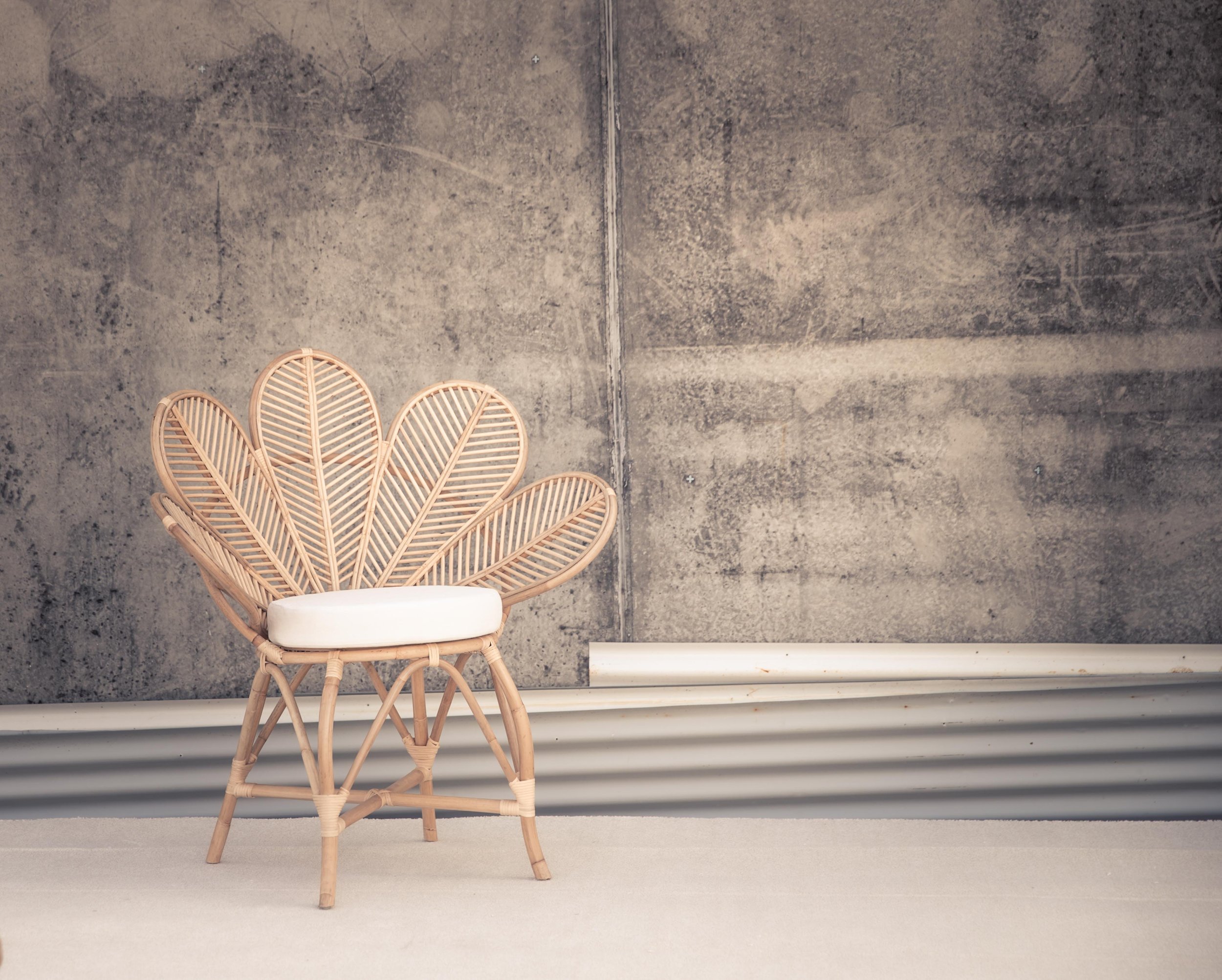
Architecture, the tangible outcome of which is itself interface, already recognizes the potential here, edging physical products toward a malleable, dynamic mode of experience through movable elements like shoji panels, curtain walls, and other components that allow occupants to easily reconfigure physical space in a way that a chair usually cannot.
We know, as creators of digital environments, that we have an exponentially larger capacity for expressing this type of potential in our own work. An interface in actual space – as opposed to digital or virtual – could be the physical contact between a body and a chair, while ours is often finger-, voice-, eye-, and ear-to-device. Consider that a chair rarely learns anything from how a person sits, or where they want to put their feet, or what they can do with their hands.

Footage from The Fabricant
Designing for Self-Actualization
Kerry Murphy is co-founder of the Fabricant, a studio that produces virtual couture; that is, clothing that exists only in virtual space. When designing garments for virtual space, Murphy says that his studio uses the “language” of physical clothing design, while materials are unbound by normal physical constraints. The “raw materials,” he says, are data. The texture, strength, color, weight, and dimensions of fabric are expressed as ones and zeros. In our discussion on Design Notes⁵ Murphy also divulged his experiences creating and manipulating a photo-realistic virtual avatar of himself. Through trying on challenging garments and programming his body to perform heretofor impossible movements, Murphy uncovered something about the self-actualizing potential of digital or virtual experiences.
“My first reaction was like- like, ‘No, I would never wear that,’ but my second reaction was like, ‘But hey, what if? … How would I feel if I would go out into the open with this weird clothing that I'm wearing in my digital life?’ All of the sudden, I started becoming much more open to things that I was not necessarily open to before.”
This embodiment allowed him – as it allows others – to reflect on what it would be like if their actual-world intentions could be easily satisfied. More than that, it drew into question the subject/object relationship that Breuer and others would have assumed before the advent of sophisticated digital interface. Suddenly, the object will of the images being presented to Murphy was actually aligned with his will as a subject; directly shaped by it, in fact. The conversation became two-sided, and both were in agreement.
Tom Boellstorff echoes this dynamic in his ethnographic work on virtual worlds, including his 2015 book, Coming of Age in Second Life⁶, noting that, “corporations who simply saw Second Life as ‘interactive’ misrecognized interactivity for creation: the cultural logic in play was not that residents interacted with a commodity and its producer, but that they literally produced what they consumed through self-actualizing acts of creation.” The implications for virtual worlds – where residents can create their own body, clothing, house, and decorations using data as raw material – are clear: the resident of the virtual world exists as an entity solely through their own acts of creation within that world. Their intention for their own presentation and integration into the social milieu of virtual space is directly manifested through the world itself and the interface that governs life in virtual space.
Zooming back into our own work from here, (work which largely manifests itself on screens in the actual world) we can begin to get a better understanding of the work’s self-actualizing potential, and what it may look like to give individuals the power to create their own experiences with our products.
In the same text, Boellstorff asserts that intentional creation is not the only type of creation we have to consider when studying how intent and identity manifest in design. Besides intentional, explicitly planned creation, emergent or situational creation plays an equally important role in an individual’s virtual presence and actions. This Boellstorff compares to Swiss linguist Ferdinand de Saussure’s distinction between grammar and speech – the planned logic and mechanics of language against the practical application in everyday life. Boellstorff notes that the concept of design itself “presumes intentionality” on the part of the designer, a possible “misunderstanding of the present” that hinders our ability to imagine the future, a future, by the way, that Boellstorff admits – as we all must – is ultimately unknowable.
If we want to transform the discipline of design, then, by giving it a new foundation – one that doesn’t entirely rest on our intentionality as designers – we have our work cut out for us.
Information + Action
Right now, the digital interfaces we find on personal devices can be boiled down to two primitives. These two primitives, which I’ll call information and action are the building blocks of what we would now call user experience. From these primitives, we derive components. Components come together into UI regions, UI regions comprise screens, and screens comprise flows, and flows comprise apps. You’ve almost certainly seen it broken down like this before, from small abstracted concepts to large practical applications – I would consider all such models valid propositions, with the note that information and action are the smallest particles we can observe directly.
A foundational constraint that we often acknowledge and account for in design is “human factors,” or the realities of the human body and cognition that impact how people are able to interact with an object. These principles, which have been variously documented by standards bodies⁷ and design practitioners (myself included), often appear at the bottom of a layer cake of considerations in discussions of interface design, but in a model organized from the principles of information and action, human factors are more like the shape of the cake itself. In the future presented here, individual intent would be a human factor that – just like touch, voice, vision, hearing, and cognition – we must be able to account for in the things we create, without precise knowledge of what it is or how it might change.
In other words: if information and action are the primitives that grow, seedlike, into the full flower of an interface, how people choose – and are able – to interact with technology at that interface is a superseding layer, and that is where true adaptation really lives.
✧
Bringing Interface into Design Space
One successful implementation of design based on this type of intentionality is the accelerating development of variable type technologies, fonts that are not packaged as individual styles as foundries have for hundreds of years now, but rather as one program that constitutes a continuum of possible expressions of a typeface. The product of the design process for a variable typeface does not presume to know or understand the intent of the creators who will work with it later – graphic designers and typographers are constrained only by which variables (axes) are made available within the typeface.
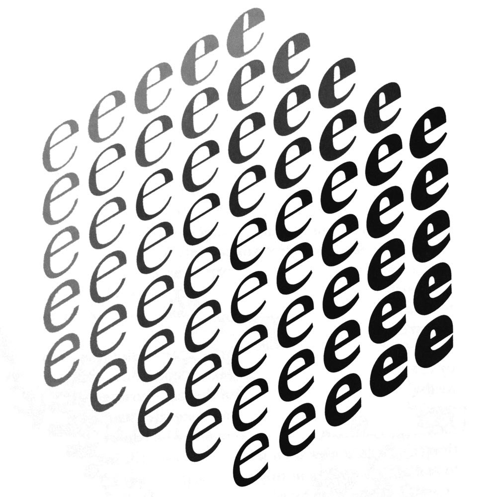
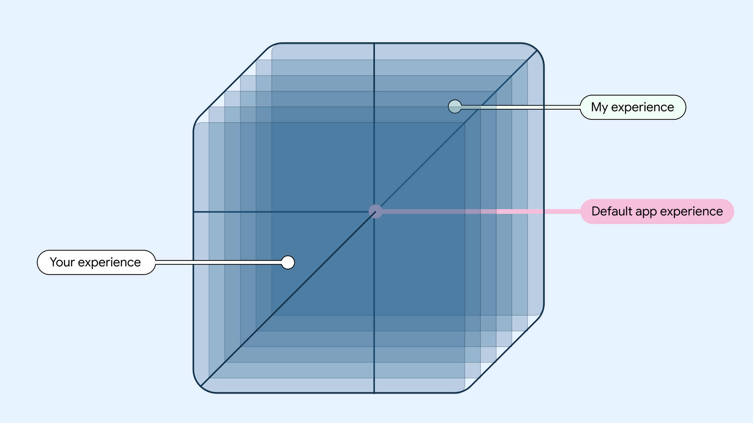
The Noordzij Cube (tdc.org) illustrates a 3-dimensional design space using the letter e.
When I studied in the Type @ Cooper program in New York, I learned from type designer Hannes Famira that a “font,” the instance of the typeface we were designing in class, was just once point in a multi-dimensional field called the “design space.” The variables in variable type, called “axes,” run through this design space like overlapping train tracks. Anywhere there’s an axis, we can see a continual line of expression through the design space. Some axes, like “weight,” run straightforwardly from one point to another – for example from thin to extrabold. Others intersect one another, drawing themselves into two dimensions. Others go on to become more complex, even having influences on several other axes as they progress through their own scale.
Project Phoebe saw digital interfaces as existing within their own kind of design space, where axes like touch or visual acuity, age, and others could all influence the instance of the interface a person is presented with. And today, we actually do have a few ways of instantiating somewhat complex axes in our work.
The Near-term Approach
A simple example to start with is adaptation across screens. In Material Design, we’ve created guidance for adapting to screens from large to small. The screens or breakpoints we document could be understood to represent individual stops on one axis – screen size – running through the design space.
But if we look more closely, it becomes easier to see moments where other axes may be running parallel nearby, or intersecting with screen size in interesting ways that we must account for. For example, on a very large or small screen, we can make certain assumptions about the device to which it belongs. A screen that’s TV-size might actually be a TV. This is information we have access to when creating an interface. What, then, might be the other axes lying just to the left or right, or overlapping with its screen size?
Design guidance for TVs specifically draws focus to things like attentiveness. We can draw from research and experience a rough knowledge of how attentive one is when watching TV and create an interface that matches that attention with the right level of detail, size of components, and types of information.
The way we organize actions around that information could comprise another axis having to do with input modality. On a TV, you’re likely using a remote control, gamepad, or other input device, rather than directly making contact with the screen. These possible modalities represent stops along this other axis, and this axis will inform how the interface is ordered in your app – how quick is it to traverse from one item to the next, or to reach a desired item from the top of the screen?
Interface design also exists in its own design space.
The natural direction of this line of thinking is to fully realize these and other axes for each app – and, eventually, an entire system – in a multidimensional design space, allowing an interface to function as one piece of technology that contains within it a fuller range of possible expressions, directly informed by individual intention; the person using the interface could determine where they land in the design space through their preferences, actions, usage, and implicit cues.

Dynamically themed imagery from m3.material.io.
Material You, introduced in Android 12, is one small step in this direction, opening up the system to an unknowable form of intent (user-selected wallpaper) which it uses to inform fundamental qualities of the interface (color schemes). In this case, the axis of color expression is populated by the HCT color space, which was created specifically for accommodating unknown user intent with perceptually consistent responses.

Visualization of the HCT color space.
There is, of course, much more work to be done if we want to realize a fully adaptive future at a system level, whether we’re talking about a design system or an operating system. (And I think we have to talk about both.)
Designing for Intent
In the more distant future, I believe that the interfaces we encounter on personal devices will be much closer to a pure flow of information and action rather than being deliberately and carefully grown from primitives to entire flows and apps.
The interface will likely exist in a framework that allows it to spontaneously arise and conform itself to emergent patterns based on the intent and subjectivity of the person using the device. The interface is, in this model, still the site of our encounter with technology. But the dynamic between object and subject (the chair designed for humans having material impacts on the humans that use it, the virtual couture designer encountering himself in virtual space) will shift, and we will see our own intent directly shaping the interface with which we’re presented.
This future would realize the promise of unwinding the designer’s intentions for the user – their behavior, their actions, their outcomes – and reconfigure the relationship, transforming it into one where the intention of digital production is simply to fit into the human environment seamlessly. The problem is no longer how to engage the user in an app, it’s how to unlock a specific possibility to the people who want or need it, using information and action.
Project Phoebe described an intermediate adaptive model that augmented existing approaches to create something responsive to invisible cues. A lack of touch acuity, for example, could be detected by nesting touch targets around a button; this was an existing technical implementation augmented for an existing component to become more than what it is.
Under a model whose interface is comprised solely (or at least mostly) of action and information, the design space discussed before could keep its axes while the visual and spacial presentation of actions and information becomes simpler and more modular.
New Deliverables
Our focus as designers, then, would be less on designing screens, flows or features, instead shifting toward meeting intents through organic composition. Our job as designers would then be to ensure that actions are presented according to information that matches the intent of the person using the interface.
We would find ourselves establishing anchor points within a multidimensional design space, determining the basic variables and boundaries that would ensure smooth gradation between regions of the design space which, in more concrete terms, would result in interfaces that remain familiar and usable and preserve the user’s mental model, but which adapt in similar ways to those described in Project Phoebe: individual actions that we might now call components would shift, adapt, and reconfigure themselves within a dynamically orchestrated layout, capable of composing and recomposing itself both in immediate response to state-changes and in longer-term progressive changes.
Design’s Responsibility
By this point it’s clear that changing the way we understand and practice our discipline will be complex. It will rely on new technology, experimental thinking, expanded resources, new tools, and a theory of design practice that reckons with our own position in the world as designers and the influence we have on how the world is experienced. In an interview for Design Notes, Senior UX Design Manager and former MoMA Design Director Rob Giampietro underscored the gravity of our work that I think makes this new model imperative:
It’s such a privilege to get to make the interface for the world. You’re deciding when someone should turn the page, how heavy their phone is that they pick up every day, whether they need to swipe to get more information or can have it right on the screen. All of those things are ways that you’re actually changing someone’s experience of their life through design. And I don’t think there could be a more transformative discipline than that.⁸
“Transformative” is an apt word here: When we design something, implement it, and put it into the world, we are causing transformation. At the surface level, we’re transforming someone’s experience of their life - that’s big enough. But we’re also transforming, potentially constraining, the range of possible experiences in the world by making choices about what a product can do and how it can do it. And we’re transforming ourselves; our discipline often puts us - our perspectives, our experiences, our beliefs - into the world within the products we create, just by virtue of the fact that we are humans creating things for other humans.
In other words, we are unavoidably present in our work. That goes for anyone who creates anything. The lives we have led until the point that we make an intentional creative choice will inform the outcome of that choice, no matter how hard we resist. This makes design a political and social action, and places a large amount of abstract – and, often enough in our industry, tangible – capital in the hands of relatively few people.
The only way to unwind some of the power we have assumed as designers is to build a process that deliberately dismantles it, putting the people we now call “users” in a better position to make their own choices, build their own experiences, work toward their own intrinsic incentives; a process that allows us to give up the notion that those things ever belonged to us to begin with.
1 “‘Gravity Falls’ Boyz Crazy.” IMDb, IMDb.com, 19 Apr. 2013, https://www.imdb.com/title/tt2813658/.
(It’s worth considering that this gif was clipped from an episode of the show Gravity Falls in which the men pictured are revealed to be imprisoned clones.)
2 “Keynote: Keller Easterling and Geoff Manaugh in Conversation (Span NYC 2015).” Google Design, YouTube, 6 Nov. 2015, https://www.youtube.com/watch?v=bBdJSLSS550.
3 “TALK: The Interface (SPAN NYC 2015).” Google Design, YouTube, 6 Nov. 2015, https://www.youtube.com/watch?v=wa7c_LrsWbo.
4 Barry Bergdoll. Marcel Breuer Bauhaus Tradition, Brutalist Invention, Metropolitan Museum of Art, New York, New York, 2016, http://resources.metmuseum.org/resources/metpublications/pdf/Marcel_Breuer_Bauhaus_Tradition_Brutalist_Invention.pdf.
5 Spradlin, Liam, and Kerry Murphy. Design Notes, no. 37, 18 Feb. 2020, https://pod.link/designnotes/episode/34608799b5dbd2ae59adea29b4b3f5f4.
6 Boellstorff, Tom. Coming of Age in Second Life: An Anthropologist Explores the Virtually Human. Princeton Univ Press, 2015.
7 “Ergonomics of Human-System Interaction — Part 11: Usability: Definitions and Concepts.” ISO, ISO/TC 159/SC 4, Mar. 2018, https://www.iso.org/obp/ui/#iso:std:iso:9241:-11:ed-2:v1:en.
8 Spradlin, Liam, and Rob Giampietro. Design Notes, no. 25, 14 May 2019,
https://pod.link/designnotes/episode/53b13783a15dfb8556137f49b19e7e45.
Taking Care
…amorphous and ever-changing, but simultaneously suggesting of the morphology that is perceived by everyone else…

Sometime in the beginning of the pandemic—maybe in April or May, when life inside my one-bedroom apartment had become ritualized but I still didn’t have any clear ideas about how anything might end—I decided to venture into one of my aspirational shopping lists titled, simply, “Art,” and buy something I had saved there. I have several of these lists, full of things I like but either shouldn’t, can’t, or won’t spend the money to get. But buying something to put on the walls felt right. I ended up buying three prints from an artist I had followed for a long time.
After completing my purchase, I opened Adobe Illustrator. There, I plotted out how I might arrange the pieces on my wall. Would I put a small print on either side of the large one? Should one hang in a different room? I focused on the particulars. If I had to stay inside for a long time (the naivety of buying a 90-pack of gummy vitamins “to last me through quarantine” had been fully realized by now), it felt right to spend some of that time changing things in the ways that I could.
Eventually, the prints reached me. The artist included the three prints I ordered, along with two smaller pieces. The extra artworks were a gift, not just because I got more than I planned on, but because these unexpected additions meant I could return to planning and configuring the artworks with a fresh perspective and new constraints. After unpacking everything and weighting the prints, I was ready to open my .AI file again.
But there was one more thing included in the package. Tucked between the prints lay a postcard. It was simple: black ink on white paper, handwritten. On the back was a line-art drawing of a man wrapping his arms around himself. The points of his elbows were aligned with one another, centered below the curves of his shoulders. His self-embrace formed a giant heart. On the front, the card said, “take care of you, Liam,” I think. Or maybe, “take care of your Liam.” At face value, I appreciated the sentiment. Inside, I relished the potential of the card’s ambiguity. That ambiguity would become a refuge where I could hide, just for a moment, every time I saw the card hanging on my fridge.
The notion of telling someone to “take care” is thought-provoking in itself. The idea of taking care of anything suggests a level of agency over the object of your caretaking, as well as an understanding of its needs. It presupposes a relationship to the thing being taken care of in which you can actively look after it and perhaps intervene on its behalf. A type of agency that felt increasingly absent as the months dragged on inside my apartment.
Telling someone, “take care of yourself” (could the “you” on my card be a shorthand?) then turns that agency into something reflective, making you the object of your own caretaking. It asks you, with full knowledge of your own subjectivity, to exercise agency over yourself. What that actually means or entails is a personal matter, as it relies on your own understanding of yourself. But the speaker is also suggesting a confidence that you’re up for the task, or at least that they give you permission and encouragement to make and act on your own determination.
If the card indeed said, “take care of you, Liam,” it expands that sense of personal direction from the speaker with an invocation of my identity as a separate being, reaffirming who I am at the same time that it affirms my agency over myself, wishing me well in the ongoing task of looking after my own wellbeing, whatever that means - either to the speaker or to myself.
But what if the little squiggle after “you” is meaningful, and the card says, “take care of your Liam?” Strange as it may read, it’s a fair interpretation of the cursive. What would it mean to overlay on the meaning of the preceding messages a sense that “my” Liam is a discrete object of its own? That my Liam is, for example, distinct from the artist’s Liam, or the Liam of anyone I meet on the street? How about the Liam that belongs to any of my friends or family members? Their Liam-objects, on which they enact their own caring or other effects? Taking care of my Liam is a separate activity from taking care of all those other Liams. A profound intimacy is inherent in the task. My Liam is different, needs different things, and has thoughts and feelings inside it, and I am the only one who can really access it. My Liam is amorphous and ever-changing, but simultaneously suggesting of the morphology that is perceived by everyone else and captured as their own Liam-object, a party favor taken home from every new social interaction.
Taking care of this Liam is a task much deeper and more nuanced than the demands of any of the other possibilities.
I indulge in considering the possibilities of the diction of this postcard because it came to me during the pandemic—a time of being alone, and a time of heightened awareness of myself and my wellbeing, and how rapidly both seemed to be shifting.
Interpreting this card’s message is like arranging and rearranging the art on my walls. The joy is not in arriving at any final or true image, but in the interpretation. It’s in the realization that the possibilities and in-between parts of the process are where fulfillment actually lies. That, regardless of what was written, or where the drawings hung on my walls, I could take for myself—from the process of deciding—the agency that was elsewhere missing. I could configure the words on this postcard over and over again, finding the version of the message that was most soothing when I needed soothing, most optimistic when I needed optimism, most kind when I needed kindness, and most thought-provoking when I needed something else to think about. And that, I think, is a way of taking care of my Liam.
Nebelmeer
A meaningful pause in the conversation between land and water.
Switzerland’s landscape is an eclectic mix of geological features acting out a constant dialogue between land and water. Traveling among mountains, through valleys, over rivers and lakes, one is given an object lesson in the forces that invite water to rise into the air, fall toward the earth, and flow in trickles and streams back to the ground. This topology imparts on the Swiss a network of highly localized cultures, linguistic practices, and climate conditions. On a given day, one could discuss the Schneefall – snowfall – in Zürich, the cielo soleggiato – sunny sky – in Lugano, and the forte pluie – heavy rain – in Geneva.
The country’s microclimates make weather apps an absolutely essential part of Swiss life. And a good weather app is one that has two primary qualities: first, up-to-the-minute accuracy. Second, a live map with clear iconography. Something I learned since moving to Switzerland is that – particularly in Winter months – knowing the state of various microclimates is crucial, and chasing the sun a sacred ritual.
Radio anchors, perhaps as an invocation to complement our holy tools, announce the altitude above which you can escape the fog each day. Enterprising travelers can then make their way up beyond the clouds and glimpse the secret sunlight inaccessible just a few kilometers away. There’s even a word for this: “Sonnetanken,” meaning to fill one’s tank with sunlight.
But ascending through the clouds to reach the sun is only half the fun, and not a fraction of the magic. Like the water constantly traversing the land, what goes up must eventually come down. Having gone up a mountain to escape the fog, you’ll be at the perfect vantage point to look down and see the same clouds stretch out around you in one hypnotizing expanse. A meaningful pause in the conversation. A space for your imagination to address the land and the water and their statements. The landscape flooded, the horizon indistinct as clouds meet the sky, you will begin to picture your descent into an ethereal, enveloping ocean inside the land-locked borders of Switzerland.
Design is Art After All
In the very same ways that art is not without design, I contend that design should not be without art.
When I paint … I look at it and I say, “The space in that corner there needs a little blue,” and so I put my blue up there and then, then I look over there and it looks blue over there so I take my brush and I move it over there and I make it blue over there, too.
This quote, and the surrounding passage from The Philosophy of Andy Warhol, has stuck with me for years. When I first read it, it seemed to hint at a sort of intuitive artistic power that I couldn’t access yet — a certain way of viewing your own work that allowed the work to exist in conversation with you as a creator.
In the full excerpt, Warhol describes his process of moving the blue paintbrush around the canvas until everything feels right, doing the same thing with the green brush, taking a look, and deciding when the painting was done. On face value this description might make it seem like a painting was thoughtless or unplanned, but I think the truth is that these paintings were embodiments of a sort of learned instinct for composing images.
And, like Warhol’s paintings, type design illuminates a powerful method of intuitive composition that can be applied across design disciplines.

Still from Shields’ lecture
As part of the Type@Cooper program, students can attend guest lectures in the Herb Lubalin lecture series (archived on Vimeo). During one such lecture about wood type, speaker David Shields diverted into Rob Roy Kelly’s book A Collector’s Guide to Trivets & Stands, which thoroughly catalogued the utilitarian objects. Shields mentioned that trivet design is actually quite typographic in nature. And I wondered what the possible connection could be, before realizing that maybe it was about the composition of the trivets.
Still from Shields’ lecture
The same way I’m learning to balance counter shapes with strokes to create cogent and readable letterforms, someone designing a trivet would seek to balance air with iron, creating a cogent and usable platform for a hot dish.
Back in our studio sessions every Tuesday, I would bring my latest design proofs up to Hannes Famira for critique and guidance on where to go next. Hannes can see things I can’t in the letters. He can pick out a control point from across the room, and see a “lumpy” contour with his eyes closed.
Halfway through the term, I was saddled with two interesting themes. On one hand, the idea that the compositional rules of type (beyond the orthodoxies of cap/lowercase proportions, serif construction, etc) could be broadly applied to other types of design and creation. On the other hand, the idea that there’s an advanced compositional sight and instinct possessed by experts — an instinct I couldn’t yet access.
And certainly this isn’t a new idea. “Be good at balancing compositions” is not a groundbreaking development. But instead of simply saying “knowing how to compose is important,” I want to take both of these ideas, open them up, and integrate them into the practice of designing interfaces — the thing I’m best at, and to which I tend to relate every new idea.
What isn’t design?
In a recent interview I said something that I’ve thought for a long time but never said openly — all things that are created are art.
What I mean by this, at least partially, is that there’s probably no point in spending mental energy sorting things into columns of “art” and “not art.” I don’t want to say something is “not art” and then be on the hook for determining what is. But I also mean to say that we should think more about things as intentional creations that have their own intrinsic meaning and that communicate something from the creator to the person encountering them.
Yes, this means I think the Venn diagram of art and design is basically a circle.
The unspoken second half of this statement is that all things created with intention are designed. Yes, this means that I think art is designed and, yes, it also means I think the Venn diagram of art and design is basically a circle.
I think it’s tempting to think of art and design as entirely different concepts because design feels like it’s different—like it has different goals, different processes, and often a more systematic role in how products are made. In an episode of Design Notes that I recorded with Fictive Kin’s Cameron Koczon, he said the following:
…when I ran Brooklyn Beta, I saw a lot of attention on design and it became something that VCs were talking about, business leaders [saying], “you gotta have it. You gotta get yourself some design.” … “Design,” the word, is now everywhere. Good job the word “design.” But designers, the community — I don’t think they’re getting much from it and I don’t think that those of us on the receiving end of designed products are getting much from it.
Koczon’s point (which is fully detailed in An Important Time for Design) is that the idea of design, particularly in tech, became sacred, and — adding my own interpretation — that the word itself became a sort of empty container into which we could pack our own strongly-held beliefs and ideals, often about the things we want or hope for. The practical result of this, according to Koczon, was not an elevation of the designers creating these new sacred objects, just of the word and the idea of the practice.
I think understanding that perspective, and giving myself permission to step back from the narrative that design is somehow an elevated mode of operation, allowed me to see that perhaps there was room to challenge other orthodoxies of design in tech, or at least to introduce new ideas to the conversation.
I already want to challenge our conception of interfaces as static or terminal creations by allowing them to live with users, but maybe right now, in the present, while we’re still dealing with interfaces that don’t adapt at that level, we can let down our guard around the concept of what design is (it’s a lot of things) and start to borrow again from the intuitive practices of disciplines like type design to inform and invigorate our work.
Learning to intuit
Something I had to unlearn when I started learning type design was the instinct to rely on numbers. Stem widths and spacing metrics called to me as opportunities for a strong system. I should be able to figure out the right values and apply them evenly across every glyph, right? Wrong. So, so wrong.
Many elements of type design are created and adjusted optically, and while the notion of a system is strong in type, the system seems to act more as a collection of concepts than a collection of immutable components. Mapping the optics and systems I know from interface design to type design consistently creates conflict in the letterforms. And to break out of this instinct I had to learn to intuit. To do that, I needed a new perspective.
Negative is the new positive
In a weekend-long workshop about letter proportions lead by John Downer, I found that perspective. Downer told us something that really started to change how I viewed the things I was creating.
He said to think of letterforms not as discrete objects lying on a background, but rather forms constrained by—shaped by—the background. That the counters in and around the letters were really what we were shaping, not the letters themselves. We should clean up a pool of ink, not create one.

And this stuck with me. Not just because it had a major impact on how I understand spacing in type, or how I perceive letters in relationship to the background and to each other, but because it also has broad applicability to interfaces.
One of the most common criticisms I read of contemporary interfaces, particularly on the web or large screens—but certainly with more fervor on smaller screens where space is precious—is that there’s too much white space. This negative space is often called “wasted,” or “unused,” or “empty,” but if we look at it the way Downer sees type, we can evaluate whether white space and wasted space are truly the same thing. And I think the answer might be surprising.
Negative space gives form and meaning to the positive space it contains
Negative space, at its best, gives form and meaning to the positive space it contains. Viewing it this way, we can give that space specific Gestalt duties — it can create or eliminate proximity, continuity, or closure. When negative space isn’t employed to these ends, you feel it. The interface, the typeface—the design—doesn’t quite work. More than a simple exchange of screen space-for-information, we should think about and evaluate use of space on these qualitative terms.
A collection of concepts
I’m not someone who likes to say “the best ___ I know do ___,” so indulge me when I say that the best design systems I know aren’t restrictive.
One of the major criticisms of interface design’s current systematic renaissance is that the design systems we create and share are too restrictive for designers, stifling of expression, extension, and the intuition I want to advocate for in this post. This was certainly a sentiment we heard about the early iterations of Material Design at Google. And to that end, Material has evolved. In 2018, the notion of Material Theming imbued the system with a broad set of subsystems and parameters that allow designers to maintain the fundamental concepts and usability of Material while creating a unique and expressive system.
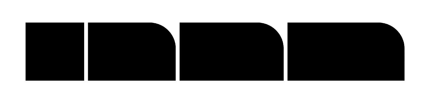
A baseline 4dp corner radius, for example, does not mean that all shaped components will have 4dp corners — corners can vary based on things like the size of a component, its relative importance in the interface, or even the action a user is taking at the moment when they encounter it. They can be modified and made asymmetric to couch or emphasize actions. The shape system in Material has solid internal logic, but maintains a strong degree of expressive range.
When I designed Wakehurst, it came out more like a fern in a greenhouse than one in the woods.
And the internal logic of a typeface works the same way. Rather than having a set menu of components that we brick together into a whole, elements can be extended, explored, and redefined to form a cohesive but dynamic family of shapes.

When I designed Wakehurst (the typeface pictured above), I interpreted my reference text with organic, leafy terminals that evoked the growth of a fern, but that were contained in a rational, structured set of glyphs. It came out more like a fern in a greenhouse than one in the woods, growing organically inside a rigid structure rather than existing among other organic forms. Looking at the top of the a as it relates to the j, the y, the &, the c, and other characters you can see the variation.
A typeface’s system, in other words, functions as a slightly looser conceptual theme. A related but biologically distinct group of plants took root in Wakehurst, and can also take root in your design system.
In interface design, these new botanic specimens often spring up in response to new or changing needs or environments. Different soil, different rainfall and sunlight. Perhaps a foraging creature has come along and nibbled on your button components. Have I pushed this metaphor too far?
Extension, exploration, and evolution are critical to a system’s longevity.
Allow design to express itself
If we return to Material Design, and think about it in the context of a large organization where a given theme may be propagated to various teams of designers for implementation in their own specific products, it’s easy to see how even this highly expressive and stylized version of Material we’ve created can begin to feel claustrophobic. When confronted with an exhaustive stickersheet like the one generated by Material Theme Editor, it’s easy to perceive highly expanded choice as a set of boundaries.
I would offer that, in fact, this breadth of stylized components provides the minimum ingredients necessary to create a diverse and expressive range of products using the same theme. I know this because we’ve put it into practice with Google Material, the theme my colleagues at Google created to help give Google apps the richly expressive properties of theming and bring the Google brand to life across products and platforms.

Google News, Google Home, and Gmail
Functioning like many design systems, Google Material has its set of components as well as a set of principles and guidelines for the type of extension, expression, and evolution discussed earlier. And while the sorts of components and interactions the system provides are highly expressive of a very specific brand, teams have done a brilliant job of bringing apps like Google Home, Tasks, Calendar, Keep, and Gmail to life with Google Material in a way that still allows each to maintain a core personality and experience.

In the same way that Wakehurst uses stroke terminals to delineate different types of glyphs—for instance lending leafy edges to the $ to differentiate it from the S—carefully selecting, composing, and extending components of a bounded system can create interesting and dynamic personalities for related interfaces.
Harnessing intuition
The truth is that—as humans—we all bring something with us to the design process. The accumulation of our experiences, interactions, tastes, beliefs, and biases, are all revealed in our work. The things we create are naturally extensions of ourselves. And while it’s important to be able to emotionally detach from our work, it’s impossible not to see in it our own reflection.
Intuitive composition can feel volatile.
As an engineer, writing code to accomplish the same task on two different days will probably yield different code. As a type designer, I manage files carefully because I could never make exactly the same precise optical curve adjustments twice.
Intuitive composition can feel volatile. The lack of exact, infallible rules feels like a risk.
The key is to use intuitive powers with intent.
That our work naturally lends itself to containing pieces of our individual lives is — first and foremost — why it’s important to work with other people across a wide range of perspectives, backgrounds, and experiences as a designer. But it’s also why harnessing the things that make up our instincts and intuition is crucial to creating an intuitive composition that remains compassionate, thoughtful, and of course usable.
The key is to use these intuitive powers with intent.
Warhol’s make-it-blue-over-there painting technique functioned with the intent of balancing a composition for mass production.
Viewing typographic glyphs not as solid objects but as shapes bounded by the spaces they occupy functions with the intent of creating readable, comprehensible text.
Shaping components by their size, elevation, and importance functions with the intent of building strong mental models for a complex interface.
The goals of these examples may be different, but the process, the human qualities of the systems at work, and the instincts we build around that, are more similar than we may acknowledge.
So in the very same ways that art is not without design, I close by contending that design should not be without art.
The Design Notes Visual Identity
Designing the identity of Design Notes

If you’ve followed me for a while you might know that the Design Notes podcast began as a side project, recorded from my apartment after work with guests from around the world. It was a long-format show usually pushing an hour in length, with very light editing and a loosely defined identity that changed with every guest. Aspects of the identity like music were things I didn’t have the time or budget to perfect, so some components of the show existed only because they had to. Still, making the show was fun and I wanted to keep it going because I knew there was still a lot to learn from folks in other fields working on other projects.
In Spring 2017 I joined Google and — as one of my first projects — I began working with teams from Google Design and Google’s content studio in New York to bring Design Notes back to life as a Google Design Podcast.
In its previous incarnation, I featured guests from Google as often as I could — many of my listeners were interested to hear how Googlers thought about design and what they were up to. But in bringing the podcast to Google Design, we decided to focus on those in creative fields outside Google, opening us up to a much broader range of disciplines and ensuring that Design Notes could offer something really unique and somewhat more focused in its mission to inspire designers by examining how folks in other fields approach the considerations we all have to make. Like the opening says, we want to discover “what inspires and unites us in our practice;” how designing furniture, clothing, generative identities, games, toys, roads, and language learning platforms is all related, and what we can learn from each to apply to our daily work.
As we continued to flesh out what the show would be, we also began working on the show’s identity, both visible and audible. Anthony Zukovsky, working from a pile of inspirational snippets and samples and the concepts I wanted to keep core to the identity, came up with the initial concept that’s now become a full system — the simple circle and square becoming the D and N of Design Notes.

One of the biggest components I wanted to keep in the identity was its flexibility. It was important that the identity could not only adapt to the various promotional assets we would need later, but also that it could adopt various textures, materials, colors, and images to describe or allude to each guest’s work. Still there had to be something foundational that made it feel like a cohesive system. We found that in basic shapes and typography.
In this post, I want to unpack the core components of the Design Notes identity, the assets it’s used to create, and how we can use this system to adapt imagery across those assets.
The core components
Shape
In silhouette, the Design Notes logo (and all its branded assets) looks like a rectangle with the upper right corner curved to almost 50% of the shape’s total height.

Inside that base shape, we distinguish two surfaces. One, the D shape, a solid color with text on top. The other, the N shape, with imagery.
This basic configuration extends and contracts to create a range of branded assets for each episode which listeners, viewers, and readers can see across podcast players, YouTube videos, and show articles.
To cover 3:2, 2:1, 1:1, and 16:9 aspect ratios, the silhouette of the DN logo extends horizontally, maintaining the proportions of the clipped corner and the D shape at every size.
Even if the artwork supports it, however, you’ll never see a DN asset at longer than a 2:1 aspect ratio. At longer sizes, the relationship between the D and the N shapes becomes too tenuous, and the imagery starts to draw too much focus in the composition.

Ok, you’ll see it once - right here.
Where possible, I also try to allow the imagery to complement the shape. In the case of DN07 above, the mountain of furniture at the far right of the frame follows our rounded corner nicely.
The consistently-sized D shape makes a convenient container for short strings of text broken into two lines, but inevitably some episode titles are too long and must overflow. In this situation, text (usually the second line) is allowed to overflow onto the N shape, provided there’s enough contrast in the imagery to support it.
This is a problem we allowed ourselves to face early on with the Material Design Awards episode.

Typography
The Design Notes identity relies on Work Sans Extra Bold, almost always set in one or two white lines.
Because the Design Notes assets need to adapt to multiple different sizes and aspect ratios, I needed to come up with a way of maintaining proportion and optical spacing across assets.

The Design Notes art uses a line-height value that isn’t standard to Work Sans, allowing the descenders of the top line to nestle snugly into the ascenders of the bottom line. I wanted to establish a consistent relationship between the character size and line height, so after measuring this relationship on the initial assets we created, I adjusted the type to get the line height to roughly 85% of the value of the character size. As I worked my way down from the largest assets to the smallest, adjustments were made to clean up each value while maintaining the optical relationship.

This means that for the largest assets — the cover art and 3x2 hero image — the type is set at 300pt with a 256pt line height. The next size down is 224/192, and the scale continues to 200/170 and 116/98. But of course because this scale is determined solely by the relationship between character size and line height, it means that it could extend to other sizes in the future.
When setting text for Design Notes, this relationship flips — the line height becomes 1.05x the character size to increase balance and readability in wider layouts. This relationship is primarily used in Design Notes’ social assets, where we highlight quotes from the show.
Speaking of these social assets, they required a non-standard text treatment of their own. For each asset, the episode number and title are shown throughout the video, but I wanted to deemphasize this information compared to the quote itself. Doing this uniformly as the background changed from episode to episode required an overlay treatment. So each episode’s metadata in the social asset is set to 40% opacity. This ensured that it would be less visible than the quoted text (which is 100% opacity white) but still appear with a consistent relationship to the background color, whatever it happened to be.
Color
Design Notes art typically uses a simple three-color palette for each episode. The first color is white, used for text on each asset. The other two colors are extracted from the imagery that appears inside the “N” side of the artwork.
One of these extracted colors is the primary color — this is the color that fills in the “D” side. There are three primary goals for the primary color:
Be unique
Complement the artwork
Ensure readability
The first goal, standing out, is pretty simple. There is no defined palette for the Design Notes artwork, just a loose guideline to avoid repetition and preserve as much contrast as possible with the text (the third goal). Since there is no preset palette, there are a lot of directions the primary color could go.
To figure out what color to use, I typically sample several swatches from the artwork in the “N” side, and test them across a template file I’ve set up to cover all the main assets we use for the show. I like to pull out tones that feel like an accent to the artwork, rather than simply pulling the dominant color.

One exception to this approach is the SPAN 2017 series of interviews, recorded by guest host Aaron Lammer in Pittsburgh during Google’s annual design conference.

Early explorations of co-branding with SPAN’s identity
For this series of four episodes, we chose to co-brand the art with aspects of the SPAN identity. Specifically, we drew from a palette of color combinations, and switched to strictly photographic content for the cover art, using portraits of each guest.

To fully realize the color pairings established by the SPAN identity, I gave the images a subtle treatment , blending a gradient on top of each with the complementary color from the SPAN palette. These complementary colors replaced — in the SPAN series — the second sampled color I mentioned above: the secondary color.
It’s rare to see secondary colors used actively in Design Notes artwork. Usually they provide subtle image treatments, or they might be used to back assets like the Cue Card that require higher contrast. They can belong to the same family as the primary color, or they can strike a contrast, depending on each color’s prominence in the overall artwork.
The assets we might choose to use for each episode can be unpredictable, so this approach to color allows the DN artwork to easily adapt to whatever it’s given.
Imagery
Outside of special cases like the SPAN series of episodes, Design Notes art typically uses textural, abstract, or re-contextualized imagery to fill in the “N” side. The idea is that the art should stand on its own but that — after hearing the episode — the listener can return to it and find new meaning.
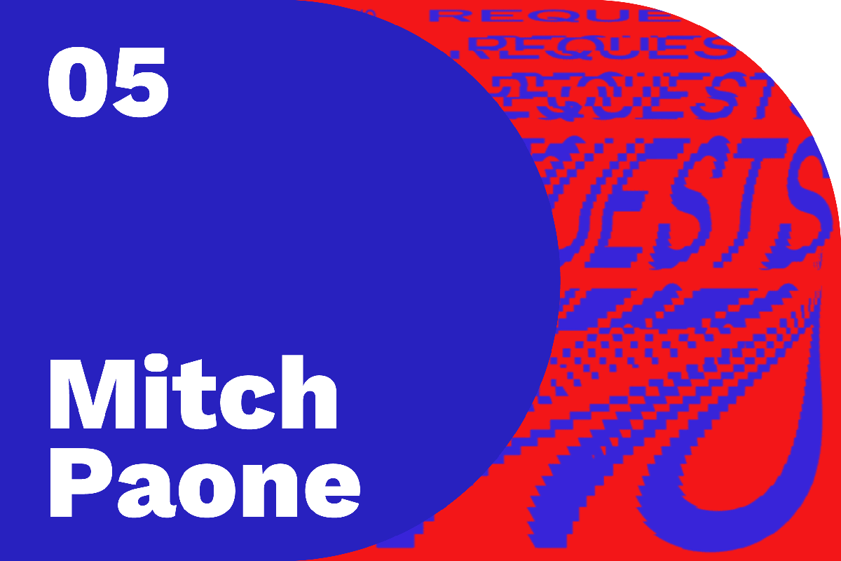
The episode with Mitch Paone of Dia studio, for example, uses a cropped version of a text animation that says “no requests.” In the interview, we learn that Dia produces kinetic identities. The studio created this specific sample for Canadian DJ A-Trak to use in stage displays.

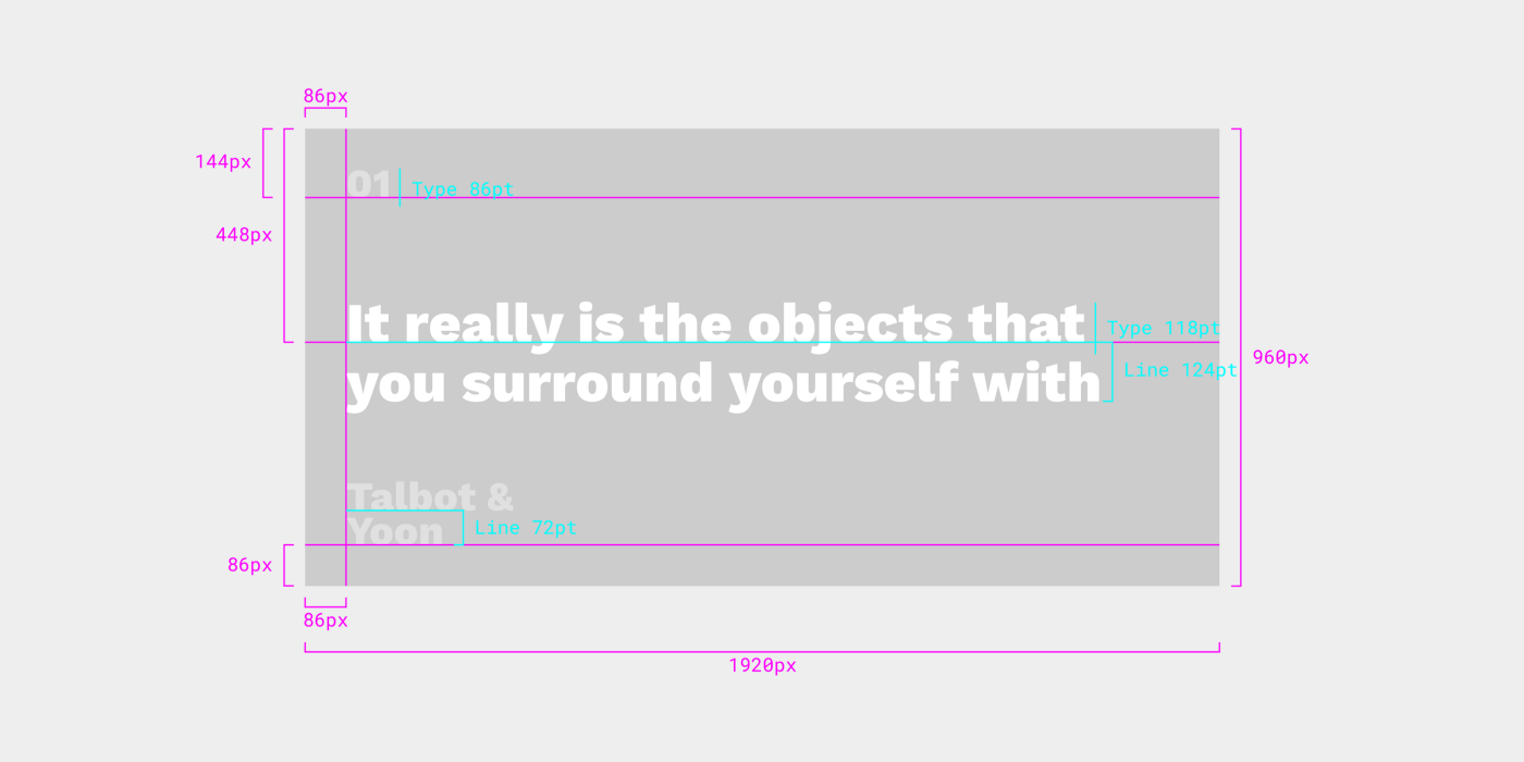
The art for Design Notes’ premier episode, with New York-based design duo Mark Talbot & Youngjin Yoon, shows us a closeup of a grate pattern. During the interview, we learn that this is their experimental soap dish, crafted as a miniature tetrahedral waffle slab, inspired by architectural components used in Louis Kahn’s design of the Yale University Art Gallery.
In this way, the Design Notes art is designed not only to give the full spotlight to each guest and their work, but to provide ongoing — and changing — meaning as you experience each episode.
Putting it all together
All of these elements come together to create the various assets we need to publish an episode. These are divided into four primary asset types: Podcast, Article, YouTube, and Social.
Podcast assets
The only real asset in the Podcast category is the square logo and its customized counterparts for each episode. Podcast platforms like iTunes or Play Music use the square logo to represent the show, while some platforms — like Pocket Casts — allow listeners to see custom artwork for each episode.

So while the majority of listeners will never see the customized square art, it’s a nice touch for those who do.
This asset establishes many of the patterns reflected in the other assets — a consistent left keyline aligns the episode number and name, and the same measurement is used to place the bottom baseline. That measurement also loosely determines the placement of the episode number, in that generally the top of the cap height of the episode number should be the same distance from the top as the bottom baseline of the episode name is from the bottom.
Article assets
There are three primary article assets needed for each episode of Design Notes, and they’re all variations on the D+Extended N discussed earlier.

The first is the 2x1 Hero, which shows up on the front page of design.google when each episode is initially published.
The 3x2 Hero, meanwhile, appears in the general feed when the article isn’t being featured.

The 3x2 Hero uses the same 128px base measurement from the square logo, and this measurement is scaled down proportionally for the 2x1 Hero which has a smaller height. Similarly the type is scaled down according to the approach discussed above.
There’s also an even smaller asset — the Share asset. This asset is what shows up when someone embeds or links the article on a social platform like Twitter, G+, or Facebook.

The base measurement and typography scale down again, along with the length of the “N” side of the shape.
YouTube assets
The YouTube thumbnail is stylistically and systematically very similar to the Article assets, except that it has a non-transparent background.

Typically the background for thumbnails is white, to prevent YouTube from filling in the transparent area with another color or adding artifacts to the curve of the “N.” The asset is a normal 1080p resolution to match the video.

Initially, I experimented with applying the secondary color to the background of the YouTube thumbnail, but making the background white instead results in a more compelling asset — having what appears to be a rounded corner on a thumbnail surrounded by rectangles allows us to “break” the repetition of the thumbnail grid and in some small way subvert YouTube’s standard layout.
Social assets
Occasionally, we create additional assets to promote an episode on Twitter. I call these Cue Cards. They don’t feature the “D” or “N” shapes — instead they’re just cards with backgrounds colored to match the primary color of the episode, and a snippet of text from the episode.
The type style follows the body style outlined above, meaning it has larger line heights than the DN artwork to improve readability, and the name and episode number are both given a translucent treatment so they can fade into the background and avoid distracting from the main text.
…And the transcript
Finally — not belonging to any of the above categories — there are specs for the Design Notes transcripts, too. Each episode, we release a full transcript of the interview to accommodate reading or listening. Since these are text-based PDFs, it’s important that they maintain a consistent layout and style so the reader knows what to expect and can get straight to the content.

A simplified type scale separates metadata from content, and generous horizontal spacing lets you know who’s talking while keeping that info distinct from what they’re saying.
Establishing a flexible identity system for Design Notes has helped me refine my approach to creating self-contained but adaptable systems. But it’s also reinforced and reemphasized the goal of the show: highlighting, examining, and — most importantly — learning from those working on other types of design, and finding those aspects of their practice that we can integrate with our own.
You can keep up with Design Notes at design.google/podcasts and subscribe on Google Play, iTunes, Pocket Casts, Spotify, Deezer, RSS, or wherever you listen to podcasts.
Experiencing the next mutation: user characteristics, defining success, and a new way to research mutative patterns
In the months since launching Selene and the second post about Project Phoebe, a lot has happened. But most of that isn’t important.
What’s most important to me is that I’ve traveled from Mountain View California to New York City to Warsaw, Poland to talk about mutative design. I’ve talked to designers, developers, users, coworkers, strangers, my partner in crime Francisco Franco, and — yes — to myself about the theory and the practice behind mutative design and Selene’s nascent mutations.
At times it’s felt like I haven’t been getting enough work done on Project Phoebe to publish another piece, but it only feels that way because I’m having so much fun talking to people about it.
What I’ve experienced through all of this, though, is that people are excited about this possible future. The implications for accessibility (including situational limitations) and even more intimate experiences with the devices we carry and see around us are big and sound magical. But along with this enthusiasm, I’ve gotten a ton of great questions. Questions that pick out a lot of the fundamental problems we’ll need to solve to bring mutative design to its potential, and questions that highlight for me some of the unnamed or unexplained pieces of theory that will help us talk about mutative design in the future.
In this post I want to take a step back and define some terms, walk through some of the fundamental questions, and provide some possible answers before looking at what’s next for Project Phoebe.
Refining terms
Outside fundamental questions, I’ve gotten a lot of feedback that’s lead to new explorations for mutative design and feedback that’s illuminated new ways to talk about the concept. We’ll dig into some of that here, refining some of our existing terms to better express the methodology we already have.
Characteristics, realities, and behaviors
In the first two posts on Project Phoebe, I discussed “user realities.” The phrase was used interchangeably with “characteristics” to describe the fundamental facts about a user and their situation that impact the ways in which they use interfaces and systems.
But I think as we work toward researching and implementing more mutations, it might be necessary to break this down and separate the terms. While user realities refer to groups of factors that may impact interaction, we can zoom in further and see individual characteristics and attempt to understand how they might interact with one another.
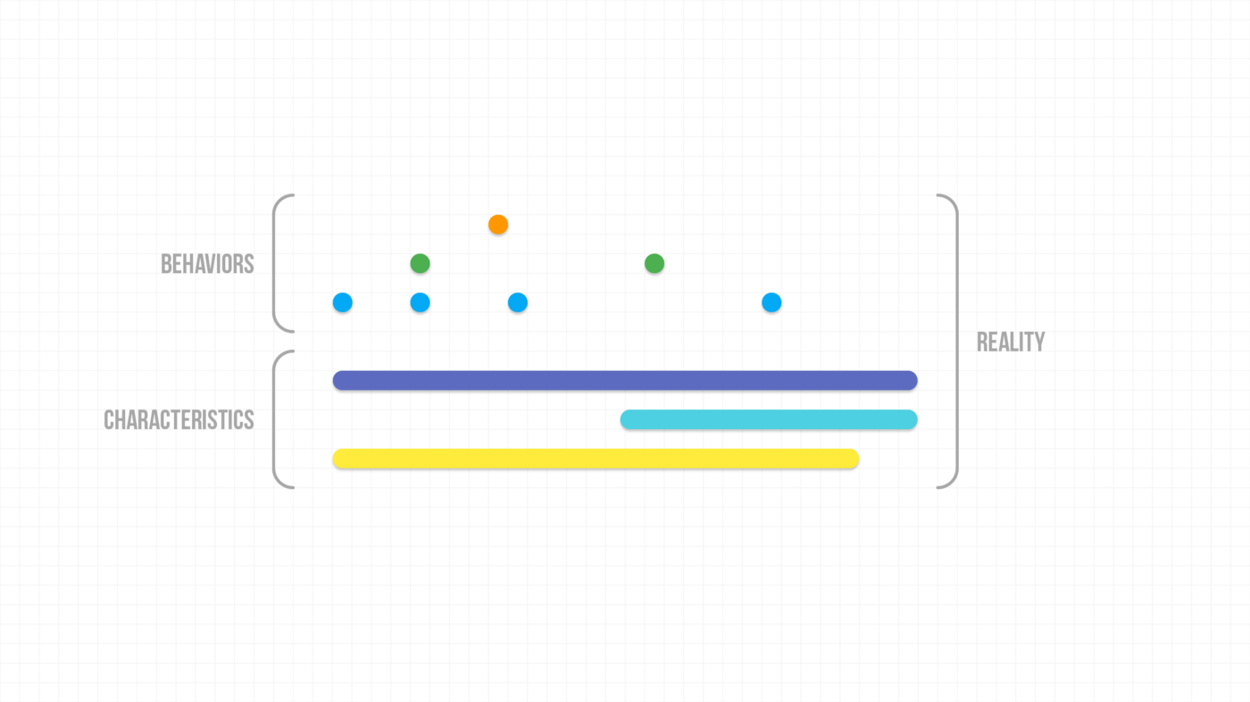
A characteristic is part of a reality. It can be something as simple as exposure to bright sunlight, or as complex as literacy or familiarity with digital interfaces. Whatever it may be, a characteristic is just one fact about a user that Gaia uses to paint a complete picture of that person’s ongoing needs. Thinking of the term this way gives us greater freedom to explore and discuss how mutation happens.
Getting even closer, we can observe behaviors, or things the user does or experiences that don’t actually form an ongoing characteristic. These behaviors can manifest a true need for the user without becoming part of their ongoing reality. Behaviors may be things like driving a car, trying to use the device with soiled hands, or even navigating through an app a certain way.
Having broken out the user reality into these components, the obvious next question is — how does Gaia decide to trigger a mutation in response?
The mutative lifecycle
In one session, someone gave me the example of arguing with their girlfriend over text — the next day, after the argument, would some of the keyboard’s keys be dramatically larger or smaller in response to a long series of imprecise taps?
We can’t be sure if resizing key targets would really be a good mutation without further research, but to actually answer the question we have to define the mutative lifecycle a bit better. In other words, we should begin to explore how a mutation is born in response to user characteristics and behaviors and whether those inputs are significant enough to even cause a mutation.
In this particular case I think we would not expect to trigger a mutation. The argument in question took place once, over one night, so it should be clear to the system that this is a short-lived state, rather than a true characteristic or behavior. Furthermore the behavior ostensibly only impacts one component of the system — the keyboard.
Mutations for characteristics should ideally happen gradually, with speed increasing as we grow more certain of the characteristic. Mutations for behaviors, while more sporadic, should be executed even more cautiously, as a behavior that’s not based on a characteristic may pose a less pressing need for the user, and may be more difficult to confidently identify. That said, mutations for short-lived states should either happen instantly and continually until the behavior is done or not at all.
So it’s possible that in our text message argument example, the keyboard could change in the moment to better facilitate angry typing, but it’s also likely that change would be too risky and too specific and the system would avoid it altogether.
Explorations
Desire paths
Something I’ve been asked about a lot is whether mutations might adapt to user preferences and not just realities, characteristics, or behaviors. For example, if I — as a user — consistently go into the settings menu to tweak one setting or another, might that setting get surfaced somewhere closer to the main screen so I can accomplish that task faster?
I think there are a couple of answers to this question, but my general instinct would be that we need more information — as designers — about that feature. It might be the case that the feature shouldn’t be in settings at all. Maybe most users are tweaking this setting and whoever builds the interface just isn’t analyzing it explicitly. Ignoring whether we’d break mental models or muscle memory by moving features, is it mutative design’s responsibility to solve for bad or ineffective design?
The short and very easy answer is “no.” But the more thoughtful and realistic answer is that the question is more complex than it lets on. When speaking with designer/developer Nick Butcher recently, I learned about a design experiment done with a sort of dashboard interface, where panels would actually respond to frequency of usage by — for instance — taking on more saturated colors while other panels gave up focus. This approach is kind of like allowing a “desire path” to form through the UI. When people feel like the sidewalk is too cumbersome, they cut through the grass until a path starts to form.
It isn’t outside the realm of possibility that this sort of thing could be a mutation of its own, but ultimately we have to continue asking — is this really responding to a user’s needs and helping them more successfully use the interface? How could we know the answer to that? We’ll explore this later in the post.
Characteristic collision
One great question I got during a talk at IDEO was about conflicting characteristics. Is it possible for two mutations — both responding to a real need — to collide in a way where one conflicts with the other? Of course the answer to this is yes. But how does Gaia respond to this?

The example given was from Selene. The app has a “contrast mutation” provided by Gaia that enhances contrast by shifting certain color values in response to changing light conditions. What, someone asked, would happen if the user had low vision and therefore special contrast requirements? This example was fairly easy to solve for — in this case, the vision characteristic would take priority over the contrast mutation. Since enhanced contrast would likely be part of Gaia’s accounting for low vision, that would be the baseline, leaving little room for the contrast mutation to play out in response to light.
There are “harder” examples than this, but ultimately characteristic collision is just a thought exercise for now — we can’t yet predict exactly what mutations will prove successful for every given reality. And this limitation leads into something that I think will be at the core of mutative design’s tangible implementation: determining whether a mutation is successful for a given need.
Gaia and determining success
Gaia, introduced in the last post on Project Phoebe (and the Selene sample app), is ultimately intended to become a platform for mutative design, so that mutations would be managed centrally, rather than being the responsibility of each individual app.
We aren’t there yet, but it is important to go a little deeper on how Gaia should work so we have a clear vision for what to try next.
Basically, Gaia would be responsible for managing, containing, and distributing instructions for mutations to connected apps. It would then gather information about the “success” of each mutation from those apps, and from that analysis adjust mutations for future iterations.
This cycle mimics the existing cycle of testing, feedback, iteration, and rollout that we already do as software designers and developers, but automates and distributes those changes in a way that allows the experience to really belong to and actually help every user. And that sounds great.
But if we think about it for a minute, the complexities immediately become apparent. Perhaps the most fundamental challenge here — ignoring for now the code behind such an undertaking — is determining what “success” means for a mutation.
This determination of success will influence how users experience the mutation and whether the mutations are truly serving their needs. To figure out how we might define this, let’s first look at what we know about our goals for mutations.
After the starter state, we want mutations to happen over time, not in great leaps.
Mutations should balance impact with perceptible change. We want the greatest impact with the smallest perceptible change.
Mutations should only happen in response to a real and ongoing need, not in response to situations that are one-off or very rare for the user.
So ideally, “success” means meeting all three of those criteria and quantifiably improving the rate at which users are able to accomplish goals in your app.
Points 1 and 3 relate to the intent of the mutation, or its reason for existing. An appropriately long timeline for determining whether a mutation should happen validates whether it’s happening in response to a true need and protects the user from “great leaps” of change in the interface.
For example, in Selene, the intent of the contrast mutation is to improve text readability in difficult lighting situations. The “onboarding” mutation’s intent is to help the user learn to create a note, fulfilling the purpose of the app.
We could then define the mutations’ goals as “helping users read efficiently in bright light” and “helping users create a note for the first time.” Success is then based on whether users have performed those actions more with the mutation in place.
These mutations represent two possible paths for defining goals (and by extension success) for mutation.
The first being an implicit acceptance of mutations from Gaia that are reflected across the system. If a user has the necessary reality for contrast enhancement, any component with a background color could automatically receive the instructions for enhancing contrast for certain scenarios.
The second is an explicit statement of intent from the app. Part of the information the app would provide back to Gaia would be a statement defining the goals for certain components. In this case the app would tell Gaia that the goal for the FAB is to create a new note, and it will therefore accept instructions for mutations that will accomplish that goal.
I think both of these paths would be executed concurrently and on an ongoing basis.
Changing how we feel about change
One of the most common and foundational questions I’ve heard about mutative design so far centers on users’ acceptance (or, more commonly, rejection) of change.
A “duh” kind of functionality that — like the mutations themselves — takes hold before we even know it’s there…
Right now in the climate of interface and experience design, change is often met with negative sentiment. As I’ve written before, we live in a reality where updates to something like YouTube’s channel page are described by some users as “utterly horrifying,” sparking backlash and change.org petitions before users eventually convalesce and learn to use and accept the new design.

Measuring a concept like mutative design against this reality paints quite a dire picture, but to measure future possibilities against current expectations is to approach mutative design from the wrong angle.
First, to avoid the issue of backlash or discomfort entirely, we must establish that ideal mutations happen so deliberately and over such time periods as to be almost invisible to the user. From the “starter state,” we’ve already made most of the adjustments we need, and as the interface adapts to the user’s ongoing reality, they’ll only notice an underlying thread of good, usable experiences, rather than great leaps of change. In Selene for example, we balanced impact with perceptible change when implementing the contrast mutation — the change in color is noticeable, but doesn’t negatively impact the experience. Notes are still distinguishable and the layout doesn’t change, but the user gets a better experience in bright light than one otherwise would.
But from a higher level, mutative design has a long road ahead. As the capabilities of personal devices change, so will our perceptions and expectations as users.
As we move from predictive technology to actually intelligent technology, and as we rely more on technology that assists us by knowing us, our attitudes about the capabilities and indeed the responsibilities of interfaces and experiences will change. Like so many individual interface elements that have been born and worked their way into common use and understanding (see: the floppy disk transcending actual metaphor to become its own discrete glyph), mutative design can eventually exist as an expectation. A “duh” kind of functionality that — like the mutations themselves — takes hold before we even know it’s there, providing that no-compromise vision of UIUX for everyone in a way that feels organic and in tune with our changing expectations.
This is a very long road. Between now and then we’ll have a long period of sorting out how mutations work, implementing them, and working on a system like Gaia that can intelligently select mutations on its own. Users have already begun seeing traces of mutations in the apps and systems they use (see Apple’s “Night Shift”), and these kinds of changes will only feel more natural and expected as we move forward.
Announcing Helios
Part of moving toward a future where we don’t just welcome the kind of change mutative design promises but actually expect it is getting a feel for where we are now. There’s plenty to find out about how people will experience mutation, how they will perceive and describe that experience, and how mutative patterns might modulate those things.
To begin this exploration, developer Francisco Franco and I are collaborating on Helios, a test suite for mutative patterns.

The app will allow researchers to adjust and — side-by-side with users — test a growing set of mutation patterns to better understand how mutations work and how the experience changes when we go from a normal interface to a customized one, both all at once and gradually.
Of course the ulterior motive for Helios is to demonstrate that implementing mutative patterns right now doesn’t have to be a complex or intensive process. In the open source sample app Selene, we showed that something as impactful as the contrast mutation doesn’t require major upheaval to implement, and Helios will demonstrate even more intricate patterns that will give users a truly personal experience, and how those patterns interact with one another.
Until the next mutation…
So what’s next in the more immediate term? From here I’m going to continue engaging the community on Project Phoebe and mutative design. Speaking about the possibilities of mutation with amazing and talented developers, designers, and users has taught me so much about what we still need to figure out. And with collaboration from the community, videos, writing, new mutative explorations and demos, and just plain talking, we will eventually see Gaia come to life as a platform for mutative design.
One reaction that has stood out to me since I started talking to people about Project Phoebe was when someone asked, essentially, how we could ever hope, realistically, to make mutative design a reality. Beyond the theory, the concepts, and the samples, how could something like this actually become feasible on the scale we’ve described?
“…I mean, it seems like it would be almost impossible to implement this,” a man in the audience said.
Almost.
Mutate More: Digging Deeper Into UI That Evolves With the User
Project Phoebe Phase 2
A few months ago, I published a post about Project Phoebe, an exploration that — I hope — will eventually help bring mutative design to reality.
Mutative design, if you missed the first post, is a new design methodology that would allow interfaces to be born, live, and evolve according to a user’s reality. It’s an idea that looks to solve the problem of designing for averages, and create interfaces that account for all users, no matter their vision level, physical ability, familiarity with technology, age, etc.
In phase 1, I wanted to introduce the idea, explore some of the very first questions, and see if others were on board with the idea. It turned out that other designers, developers, and even marketers were interested in mutative design, and some had been pondering similar subjects already. So there’s plenty to discuss as we collectively try to bring mutative design to life.
For this second phase, I wanted to have something to demonstrate along with some thoughts on the questions, discussions, and ideas that came up between Phoebe’s introduction and now.

Say hello to Selene, a simple, light demonstration of some mutative design concepts. The app is a collaboration between developer Francisco Franco and I, built both to demonstrate what it feels like — from a user perspective — to use a mutative interface, and to experiment with some of the ideas a mutative framework might need, using real code.
What it feels like to use a mutative app
One of the questions I got a lot after the introduction of Phoebe was about actually using a mutative interface. Several people noted — correctly — that having an interface change every time you use it would be stressful, annoying, or confusing for the user.
Ideally, most mutation would happen before the user ever used the app. But of course the design wouldn’t be fully mutative if it didn’t adapt to a user’s changing realities, right? So how do we reconcile a changing interface with user comfort and familiarity?
Hello Selene
One way to do this is demonstrated through the contrast mutation in Selene.
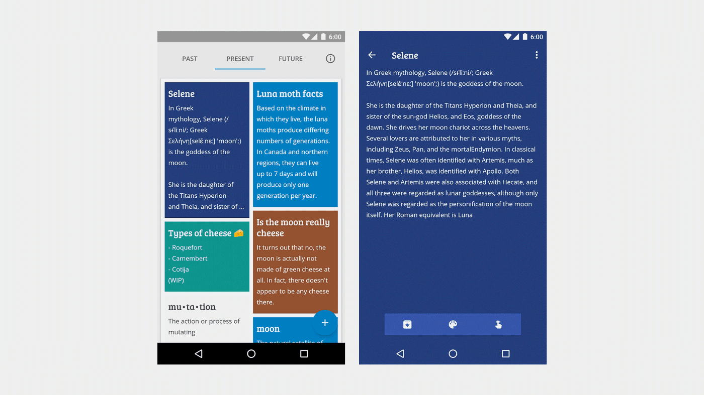
In the app, notes are able to change contrast automatically in response to changing light conditions. When Franco and I first got the feature working, I was delighted to see it in action. But after demonstrating it a few times, something clicked — the contrast was changing on the fly, constantly, in response to light conditions. We changed the intervals of change — Selene’s contrast mutation works by dividing the levels of light the phone’s sensor senses into a predetermined number of steps or intervals, which we translated to brightness and saturation values for the notes’ color palettes.
Something still felt off.
We tweaked the intervals again, and changed how the mutation is presented to the user. There were two options here, though:
We could stop the mutation from happening until the user turns their screen on and off or
The changes could continue to happen on the fly, but the mutation would happen more slowly.
The original plan only made Selene less sensitive, but these options would keep the sensitivity intact while making the mutation more palatable for the user.
We ended up going with on-the-fly transitions that were smoother and better paced. After all, it may not be natural behavior for the user to switch their device on and off while passing through changing lighting conditions.
Changes between app use
The contrast mutation is ephemeral, meaning it isn’t permanent, and only happens in short durations (on the fly as the user uses the app). Many mutations could be ephemeral, adapting to temporary realities or extra-characteristic states.
But the stronger spirit of mutative design is in lasting mutations which, immediately and over time, make the app’s interface and experience accessible and engaging for every user, no matter what their reality.
But we have to think again what it would feel like as a user to experience these longer-term mutations. As discussed before, the interface shouldn’t “pull the rug out” from underneath the user, making drastic changes that could make the app unfamiliar or uncomfortable to the user.
Striking the right balance requires a strong “mother design,” a concept discussed in the first Project Phoebe post, representing the archetypal or “pure” design of a screen, which users will likely never see.
This design establishes things like muscle memory, mental models of how the interactions work, etc. And these are pillars that we really shouldn’t mess with.
For example, we shouldn’t switch two buttons that provide distinct functions. Moving triggers for menus or other actions too far or too fast (when we must move them) should be avoided. Changing major chunks of the app’s functionality (like getting rid of a schedule sheet) shouldn’t happen. But these are practices we’ll discuss later.
Gaia: Mutation as a platform
For Selene, we intentionally chose two specific mutations to implement first, but ultimately if we’re consciously deciding as designers and developers that we know which mutations will be comfortable for every user, we have avoided the problem that mutative design looks to solve.
Our app may be mutating, but if it’s only mutating according to our own knowledge and instincts, then we are only executing a more flexible version of our existing design and development processes.
To get back on track toward solving the problem of designing for averages, we’d ideally have a framework that’s able to measure and observe mutations, centrally collecting information about mutations from apps, and informing other apps with those data.
This is a concept we’re calling Gaia.

Gaia is an idea for what would eventually be an embedded part of the operating system. Essentially, it would provide instructions for potential mutations of various UI/UX elements. But more than that, it would actually manage mutative information, receiving and distributing relative “success rates” of certain mutations, and — as it grows — speeding up successful mutations across all apps that subscribe to it.
For example, if an app implemented touch targets as mutative elements (as described in the original Phoebe post), Gaia would provide instructions for how touch targets can mutate — size, position, etc.
The app would then follow those instructions if its measurements indicate that a mutation is needed.
After mutation the app continues to measure the success rate of the user performing certain actions, and using that information, it reports back to Gaia whether the mutation was a success. If it is, Gaia can provide similar instructions to other apps for similar situations. If not, it would need to try the next set of instructions, maybe reverting back to its previous state before moving on.
Ideally, this information could be tied back to non-identifiable variables from users; their realities. This aggregated information would then be available to other apps running on the same OS on any device.
For example, Gaia could determine that for people with limited physical acuity, boosted touch sensitivity and larger touch targets are two successful mutations for buttons.
Gaia could say that for users who consistently access deep settings, shortcuts to those settings in a primary navigation area are a successful mutation to retain those users.
Gaia could determine that for young users, bolder, simpler text, brighter colors, and easily-tapped targets are successful, and that these things should change as a child user ages, easing them toward more subtle interfaces.
In this way, Gaia would allow the cycle of user feedback/analytics > design/UX changes > release > feedback/analytics to happen behind the scenes, by itself, for every user, accomplishing the real goal of a no-compromise design for everyone regardless of their reality.
Gaia + Selene
But that vision of Gaia is far into the future. So what does Gaia look like in our sample app, Selene?
Since we don’t have deep enough access to enable multi-app analysis (and we don’t actually have multiple mutative apps yet), Gaia is — for now — a class in Selene, containing instructions for exactly how to mutate different UI elements.
// makes sure it doesn't go too bright public final static float HIGH_THRESHOLD = 0.8f; // makes sure it doesn't go too dark public final static float TOLERABLE_THRESHOLD = 0.2f; public final static float LOW_THRESHOLD = 0.05f; public final static float MIN = 0.0f; /** * * @param sensor object coming from our bus containing the Ambient Light sensor value * @param mutativeObject the object that'll be mutated * @param colorToScale the current color of the mutative object * * @return a new HSV value to be applied into the object */ public static float[] computeHSV(AmbientLightSensorChange sensor, Object mutativeObject, int colorToScale) { // we divide the color into red green and blue int red = Color.red(colorToScale); int green = Color.green(colorToScale); int blue = Color.blue(colorToScale); final float hsv[] = new float[3]; Color.RGBToHSV(red, green, blue, hsv); // 'magic' algorithm float div = Float.valueOf(String.format(Locale.getDefault(), "%.2f", sensor.getLight() / ((int) SensorManager.LIGHT_OVERCAST >> 1))); if (div > HIGH_THRESHOLD) { div = HIGH_THRESHOLD; } else if (div < LOW_THRESHOLD) { div = MIN; } // Text is, by rule, in a contrasted color to the background, so we have to apply the formula backwards to the // rest of the views if (mutativeObject instanceof TextView) { hsv[2] += div; } else { hsv[2] -= div; } // making sure we don't have a weird negative value hsv[2] = Math.max(hsv[2], TOLERABLE_THRESHOLD); return hsv; }Things like text and background colors are told how to mutate in this case according to the device’s light sensor. Selene takes the top sensor value (compared to the sun shining directly on a display) and chops it up into smaller intervals, transitioning between those in real time for all the elements that subscribe to Gaia.
Designing for Gaia

In the original post about Project Phoebe, we discussed the very general concepts of designing for mutative design.
The design begins with a “mother design,” the archetypal design that many users will never see, which lays out the fundamentals of the experience, the starting point.

From the mother design, we move immediately (ideally before the user even uses the app) into a “starter state” based on ongoing realities of the user. Things like vision level, physical acuity, age, etc. are all accounted for on first run, making the experience as good as possible for the user right off the bat. In our original exploration, the user was an Adult, familiar with technology, low vision, not colorblind, with unlimited physical input and full data.

From there, smaller ongoing mutations occur, with extracharacteristic states sprinkled in between (like light level, state changes, etc).
The interface/experience can move further from or closer to the mother design depending on the user. If ongoing realities (like age) change, an interface that originally mutated for a toddler may move closer to the mother design.
But now that we’re digging deeper, what does it look like to design for something like the ephemeral contrast mutation in Selene?
The contrast mutation touches mainly color, increasing contrast between text and its canvas.
So first, we came up with the mother palette — the starting point for color-related mutations.

We optimized the text/canvas palette for contrast from the beginning, getting close to enhanced contrast as possible before any mutations occurred — the light blue canvas for example pairs with dark icons. The indigo canvasses pair with light text and icons.

Inside the app, the colors’ brightness levels are modulated automatically — the brighter the light, the darker the canvas becomes. If a canvas houses dark text, it transitions to light text seamlessly.
This may seem unintuitive, but dark backgrounds with light text actually seem to provide the best chance of proper perceived contrast in outdoor lighting.
Basically, when you look at a digital display in sunlight, every color moves closer to white. A black box will become a dark gray box. A dark grey box becomes a light gray. Light gray becomes white. White boxes stay white.
Of course this means that black text on a white background becomes grey text on a white background, grey text on a white background becomes white text on a white background, but white text on a black background becomes white text on a dark grey background. So it turns out that white is really the only immutable color on digital displays in bright light.
Thus the canvas colors in Selene get darker.
Originally this mutation took the canvas colors all the way to black. But that defeated the purpose of having the palette in the first place. The note colors are used to quickly distinguish notes from one another, so if they transition to the same color that distinction is lost.
The challenge was then not only designing a palette, but designing one that could remain distinct even as the colors migrated closer to black.

Ephemeral mutations as onboarding
The best onboarding is no onboarding — introductions to an app can become lengthy, boring, and — for existing users — annoying. Ideally users learn about the interface organically, accomplishing their tasks with minimal effort.
But mutative design, as we’ve shown with Selene, can onboard the user progressively, introducing or highlighting features only if the user needs an extra push. If the user already knows how to use the app, the app can know this automatically and remain hands-off. If there’s confusion or trouble accomplishing a task, subtle mutations can lead the user.

A simple example we’ve implemented in the app is the FAB for creating new notes. There’s data to show that floating action buttons — since the introduction of material design — have promoted and increased engagement with certain actions in apps, but to someone unfamiliar with tech or the UX patterns of Android, the simple plus icon may not be intuitive right away.
So in Selene, if the user enters the app for the first time and has no notes, and lingers on the main screen for a while, the FAB will visually morph into a full-bleed button prompting them to touch and create a new note.
In instances like this, it’s important that — visually — the user can tell where the animation comes from and what it is doing. “Meaningful motion” is, after all, a main tenet of motion in material design.
What’s interesting about this particular transformation (and transformations like it) is that it’s not happening in response to user input. Typically if the user were touching a button to make this happen, we could get away with a little less explicit motion since the action is connected in a way the user explicitly intended. But for a transformation that happens on its own, the connection must be clear.
After all, once the user has the hang of creating new notes, the FAB takes back its place in the layout, lending more room to the content area.
Dark patterns
Of course there’s the potential for evil here too, or so-called “dark patterns” of UI — it’s easy to imagine for example that a custom mutation (so, if we’re living in the future where Gaia is implemented at the OS level, a mutation that lives outside Gaia) could destroy a user’s muscle memory by for instance switching two buttons with the goal being to increase engagement on one or the other.
But as discussed above, this should be avoided. In order for mutative-design-as-onboarding to work, and indeed for the whole concept of mutative design to reach adoption, it would be necessary to define patterns and best practices. To start, we’d define these based on what we know, and then once we have more live apps, we could define them based on what we learn from users. Hopefully with the next phase of Project Phoebe we’ll begin this work.
Until then…
Until we reach consensus on initial patterns for designing and building mutative interfaces, more experimentation and research remain to be done.
Francisco Franco and I have open-sourced Selene, and made the initial beta available from the Play Store for you to try out. This post coincides with my session on mutative design at Droidcon San Francisco. I will publish the talk and slides soon.
If you’re a developer, designer, or researcher interested in the future of UIUX and mutative design, join the community, start tinkering with the code, and publish your own mutations ✨
Meet Project Phoebe: A moonshot concept for mutative design
Design shouldn’t just adapt to screen size. Context isn’t all about adding more information.
Design shouldn’t just adapt to screen size.
Context isn’t all about adding more information.
These two ideas are the basis for a far-reaching design exploration that — I hope — will spur further exploration into mutative design.
In August, I spoke with a talented developer and designer, Jae Bales, about an app she was working on to help children learn to code using basic concepts and a simple drag-and-drop UI. We discussed possible ways of ensuring that the app could appeal to and be useful for children from 3 to 13 while still seeming appropriate. There was a spark here — could the app change design or copy based on the user’s age, changing as the user ages to keep them engaged?
On October 1st, I published the third episode of Design Notes, a podcast I started in collaboration with developers and designers to gather insights into the design process through the lens of their own work. In the episode, I talked to Roman Nurik, a design advocate and developer who works at Google. We covered many things, but one topic in particular stuck with me, and it was one we had touched on before: the idea that, in the future, interfaces and experiences won’t just change based on screen size or density, but will change based on real-world factors specific to the user. There it was again. Can an experience change based on the individual user? Should it? How would this work?
The challenge is a fascinating one. How is it possible to design something that accommodates such a wide, seemingly endless expanse of use cases? Does it even make sense to attempt that? Is there some new methodology that we can build up around this to make it possible? Are there any pieces at all that are possible today, without ambiguously putting this burden on “machine learning” and calling it a day?
This post will seek to take a first step into mutative design. We won’t answer every question or solve every problem here, but hopefully we’ll get down a good foundation for conversation that can keep the nascent methodology moving forward.
Does this make sense?
So first, before we go any further, does this actually make sense to pursue? Would mutative design be interesting or at least useful to real people?
Since you’re reading a post about it that didn’t already end, my answer is probably obvious, but I think the answer is “absolutely.” This is the sort of direction I predict interface design will take in the future — one that adapts to users intimately, and provides what they need not just in terms of content but in terms of interaction and experience. I believe this for a few reasons.
Primarily, the current way just doesn’t feel stable or sustainable. Right now, interfaces — even based on research and data — are built for averages. Users are averaged out into a few personas for whom the interface accounts, even if the product has millions of users. Certainly we can do better and build a system that can account for 100, 1000, or 1million personas or more. In the current system, continued post-launch data can inform future design decisions, but the gaps are too big.
Besides these gaps, the system of designing for averages often imparts nearly unsolvable design problems. When designing for averages, accessibility is too often left behind or partially implemented, because accommodating every point of accessibility would sacrifice other aspects of the design. Why can’t we design for sets of individual scenarios and let the interface mutate between those for more specific cases, producing a no-compromise design for every single user?
Second, there are many people in the world who don’t have access to mobile or internet-connected devices right now but who will soon, and there are people who are just getting access for the first time, or who are getting exposed to these technologies for the first time.
As designers we have the privilege of building our work on a legacy of existing interaction paradigms that users have somehow kept up with, but relying on that legacy excludes those who missed out on the first chapters of the digital interface conversation.
We must account for all of this, and mutative design could be the solution.
In a way, I would consider Phoebe a “moonshot” idea. It’s not realistic to expect 100% execution now, but there are pieces we can solve. I believe it would represent a 10x improvement on designing apps for everyone, and more research can be done to establish some practices around the idea.
A new methodology
“You don’t square up to every weed in this field with a righteous fight; you change something in the soil.” — Keller Easterling at SPAN 2015
I began thinking of this approach as “mutative design,” a design method that accounts for the interface and experience mutating on its own, perhaps imperceptibly, perhaps evolving with great leaps, but changing in a potentially unquantifiable number of ways according to the user’s needs and actions.
The easiest comparison I could make was to video games — I grew up playing Gameboy games like Pokemon and remember playing Tomb Raider on the PS1 for the first time and being amazed that the character could move in three dimensions. How is this possible, I thought. Whoever made this can’t have possibly coded every possible location and position into the game, right?
At 8 years old I had a hilariously lacking perception of how video games were made, but the feeling here is the same. To achieve a design that is truly able to change in this many ways, we need a new methodology. The same way developers decided how Lara Croft looks when she runs, jumps, uses key objects, pushes blocks, etc. we must decide — for example — how touch targets look when a user is color-blind, low-vision, a child, disabled, etc. and let the design structure move fluidly between changeable states in the same way.
Fundamental structure

The orange line represents one user’s potential journey through mutation states. Blue dots are potential starter states and white dots are all possible mutation states.
The easiest way I found to think about the basic underlying structure of mutative design was a grid of dots. Each dot would represent a potential mutation state taking into account all the dots from all the rows connected to it in the rows above it.
So we need to begin with a top row of “starter states.” This is a crucial part of the grid because it’s where we learn physical or fundamentally factual characteristics about the user or their environment. Things that would change the way the user is using their device when they begin using a specific app which would impact how they’re using every app.
That said, this is only the first mutation, which greets the user when they first open an app. And many of these characteristics (as we’ll discuss shortly) can and should be learned by the system. Once we move to the next row of dots, the fun really begins.
For this exercise I’ve come up with a manageable list of characteristics, with letter codes for later.
Age (A)
Exposure to/experience with technology (E)
Vision level/type (V)
Physical ability (P)
Language (L)
Data availability (D)
Lighting (S)
We can then break these factors out into potential variant states.
Age: Infant, Toddler, Child, Adult, Elder
Vision: Sighted, Low vision, Blind
Vision B: Colorblind (Deuteranomaly, Protanomaly, Tritanomaly), Not colorblind
Tech exposure: New, Familiar, Experienced, Power user
Physical ability: Limited input, Voice only, Touch only, Visual manipulation, Unlimited input
Language: Localization, RTL, LTR
Data availability: No data, low data, full data
Lighting: Darkness, normal lighting, bright lighting
Beyond this there could be ephemeral states that account for certain extracharacteristic use cases, like what happens if the user is riding a bike, has wet hands, or isn’t within eyesight of the device. These states wouldn’t have long-lasting mutative effects, but would serve their purpose in the moment.
Taking into account the starter state, we mutate to and between new states based on new learnings from the user. It goes on like this for the lifespan of the app. Sometimes the interface won’t need to mutate beyond starter states, sometimes the user could have a long and winding journey. Either way, mutative design should accommodate.
The experience should move seamlessly between these states, but the actual dots themselves are good opportunities to explore and crystalize the interface for specific cases.
Meet the user
So back to potential “starter state” conditions, how do we figure out what starter state the user is in?
A lot of the items on our list can actually be learned from the user’s system configuration. In an ideal world, the system itself would be able to learn these starter states without even asking, but the specific road to that achievement is outside the scope of this post.
Things like age and language would be determined by the user’s device account (be it Google or otherwise). Vision level and type would be determined by accessibility settings at the system level (though more detailed tracking could certainly be done beyond explicit settings). Data availability and lighting would come from the device’s sensors and radios.
Things like physical ability, though, could be determined silently by the system. Ideally the system (whatever theoretical system or OS we’re talking about) would include a framework for detecting these characteristics, and individual apps would accept these cues that would inform the interface and experience according to what elements and layouts the app actually used.
Invisible calibration
One way to invisibly calibrate the interface would be a first-run process. We see first run flows in many apps (check out UX Archive for plenty of examples) — they help the user get acquainted to a new product, introduce features, and guide the user through any initial housekeeping tasks that need to be done before starting.
But even while doing this, we can secretly determine things about finger articulation, physical accuracy, and perhaps even things like precise vision level and literacy.
One example would be adaptive touch targets.
The normal touch target size for Android is about 48dp (assumed to be the size of a human fingertip — that’s 144px on a device with a density of around 480dpi) but that’s the actual touch target size, not the visual size.
So for a normal toolbar icon, there would be about a 20dp visual size because it’s what the user can see, but when the user touches that icon it could be anywhere in a 48dp box.
A first run process (like initial device setup) could theoretically pay attention to acuity when it comes to touch targets by measuring distance from visual target and nesting actual targets around the visual target in expanding radii representing lower accuracy as the targets expand in size.

This information combined with age could give us a pretty clear idea of how big touch targets need to be in the actual interface for this particular user, but touch targets could still mutate within the design as the user goes for example from toddler to child, if we see that their accuracy is improving.
This is just one invisible way we meet the user.
Interface designers have probably already spotted this — the fundamental doubt in this approach. The potential problem is two-fold.
User confidence
First, user confidence.
…the interface shouldn’t “pull the rug out” from underneath the user…
It’s important that users feel comfortable in an interface, and feel like they know how to use it and what to expect. Likewise, the user should ideally be able to hand off their device to someone else without that second user feeling overwhelmed. How then, if the experience is mutative, can we foster that feeling?
This doubt has to be addressed before we prepare the canvas with a practical app example.
The answer to this question is perhaps too vague, but it boils down to two steps. First, the interface shouldn’t “pull the rug out” from underneath the user in one big leap. In other words no mutation should see the interface lose an arm and grow three more eyes — mutations should happen at a steady, organic pace wherever possible. This, again, is why the starter state is so important — it will get the user to an initial comfortable state immediately, and further smaller mutations would happen from there.
The second step is simply maintaining a strong consistency in visual and interaction patterns. Within the app, and aware of its possible mutations, keep an internally consistent and intentionally brief dictionary of pieces that the user will still be able to recognize no matter what ends up happening. This means everything from typography to basic button styles.
Supporting infinite characteristics?
And here’s the second problem: just how many characteristics should we measure? If we aren’t careful, it’s easy to fall into the trap of choosing which characteristics we’ll support based on who we think will use the app. That lands us right back at the problem we’re trying to solve.
I think in the short term we can’t escape establishing some set of best practices for these considerations. Defining a set of characteristics that are agreed to be representative of most possible variations in how users will use and experience a device. In the long term? I will shove this off to machine learning — once we have a sufficient amount of data I think it would be reasonable to assume that characteristics could be recognized, learned, and accounted for by machines, with the list of characteristics continuing to grow as the system meets more types of users.
Deciding to mutate
Once we’ve established starter states, the app could continue to change its interface in subtle ways — for instance in a contacts app, providing quick action icons based on the most common means of communication with certain contacts — but relative to our goals, that’s easy. What we’re really focused on is staying in tune with the user’s real characteristics, those aspects that would change how they interact with the device on a level surpassing app functionality.
Let’s say the user has a degenerative vision condition. How would that play out behind the scenes in a mutative app? Let’s think through a very basic flow where the app would decide to expand a visual target or increase color contrast based on ongoing user behavior.

Some cases aren’t that clear, though. For example, what if the user is consistently hitting slightly to the top right of the visual target? We could move the visual target slightly up and to the right, but should we?
After all, if this is a problem of perception and not of physical acuity, then moving the target may cause the user to keep tapping up and to the right, on a trail leading right off the edge of the canvas. Alternatively, does it even matter that the touches are inaccurate? I would argue that it does, because other areas of the interface directly surrounding the visual target may be targets themselves, or may become targets after later mutations.
In this case, the app could subtly try two different approaches — one suited for perception, and one for physical acuity. Try moving the visual target just a bit within reasonable bounds (meaning you don’t necessarily have to scoot a button on top of some other element). If the user’s success rate isn’t improved (or they keep tapping up and to the right still), enlarge the visual target. If the success rate evens out, perhaps it’s okay for the button to slowly scoot back to its spot.
As Project Phoebe continues with more research and conversation, we can hope to create a set of best practices for problems like these, but for now we should be open to trying many theoretical approaches and figuring out the technical details once those are settled.
Preparing the canvas
So, knowing the possible “starter states” for a mutative design, and advancing confidently in the direction of our mutative dreams, we need something to design so we can keep exploring the approach.
We’ll walk through two examples in this post, named Asteria and Leto. One app, Asteria, is a contacts app and the other, Leto, is a launcher.
It makes sense to start each exploration with a pair of “starter states,” so we can see how they compare and how they might mutate on two different paths.
To make this exploration more interesting, I wanted to avoid choosing the starter states myself, so I randomized numbers for each variable, corresponding to a particular value of that variable. So for example Age has values 1 through 5, where a randomly-chosen A5 would mean an elder user, and A1 would mean an infant.
Hopefully this randomization will help to illustrate that mutative design should work for any user.
Example 1: Asteria

faces from uifaces.com/authorized
The image above shows Asteria’s “mother design” for the contacts tab. Basically, this screen displays a search box for finding contacts/businesses/etc., a tab bar for accessing the dialer, a sliding selection of frecents, and then an alphabetical scrolling list of contacts, and a floating action button for adding a new contact. On tablets where calling isn’t possible (either because there’s no data connectivity or no WiFi calling) the dialer tab will disappear.
Nothing immediately jumps out as crazy or out-of-this-world about the mother design, but it’s worth noting that this design may be a rare sight for the user population. If all goes according to plan, Asteria will undergo its first mutation (however mild it may be) before you ever see the interface.
The mother design exists as kind of an ideal archetypal state of existence, and will be rarely spotted in practice but very important in theory. It will serve as an origin point or “mother” for all the following mutations. Any special considerations for the product should be determined for the mother design, and product-motivated actions or features shouldn’t mutate out of the UI, but we’ll have to be open to those features having a life of their own. If all goes according to plan, those features will be accessible to a greater number of people under mutative design.
The mother design, then, should accept statistics and user research in the same way that most interface designs do today. The difference is that we will no longer accept this as a good stopping point — it’s just a strong foundation for future mutation.
Starter state 1
Let’s begin with user 1: A3E3V2B2P5D3. That means our user is an Adult, familiar with technology, low vision, not colorblind, with unlimited physical input and full data. For the sake of the example let’s assume the user reads English. The lighting condition will change as the user moves through their day.
In State 1, the only factor that will make an appreciable change to Asteria’s experience is the user’s vision. As stated before, this probably doesn’t need any special discovery by the app, since accessibility settings are at the system level. So Asteria would ideally find out from the system that the user is low vision, and make the first mutation by itself the first time the app runs.
But some accessibility features should have already been considered in the original design. For example, contrast. For normal text, the recommended text-background contrast is 3:1, or to account for low visual acuity, 4.5:1.
Black text on a white background has a ratio of 21:1, so we’re obviously in the clear there. Our bluegrey color with white has a ratio of 4.4:1 which is close, but not quite to the recommended level, and certainly not up to the 7:1 recommendation for “enhanced” contrast. So, knowing the user has low vision, we can make an adjustment to get us all the way to enhanced contrast. The text size would of course be accounted for by the user’s system preference.

What happens next? As discussed earlier, we could mutate further based on the user’s behavior. If the user frequently calls Amy Herrera for example, a phone shortcut icon could appear next to her contact entry. But that’s a pretty easy mutation that can already be accomplished today. So theoretically Asteria could stop mutating for user 1 right now, unless something changes in the future.
If we find that the user is lingering on this screen without tapping anything, or is swiping around aimlessly, the interface might surface labels to help them decide what to do, or point out important information. If the user is swiping up and down through contacts frequently, we can even highlight features like search. Once the user uses search a few times, the highlight can fade as we assume the user is now familiar with it. Here’s what that state would look like:

Starter state 2
The second case will be user 2: A2E3V1B2P5D1. So this user is a toddler who is familiar with technology, who is sighted, not colorblind, has unlimited input, and no data. Why would a toddler be using a contacts app, you ask? One perk of mutative design is that we don’t necessarily need a concrete answer to that question. We just need the infrastructure to react to this case.
For this user, the two factors most likely to impact our design considerations are that the user is a child, and that the device they’re using has no data connection (this may be temporary or permanent — we don’t know).
Notice that our randomized state says that the user, despite only being a few years old, is already “familiar” with technology. Still to be decided is how we would measure familiarity. Things like how many times the user backs out of an action (and how fast), how long they linger on a non-text-oriented screen (hunting for the right option), etc. could tell us this, and would measure “familiarity” relative to age. So “familiar” for a toddler would measure differently than the same characteristic for someone whose age group has a higher functioning average of “familiar” behavior.
That said, as UXMatters explained back in 2010, we shouldn’t automatically consider a design for children to be radically different at its core than a design for an adult. An important distinction to make, though, is that the post linked above dealt mainly with the web, assuming the user is on a computer.
Computers have a unifying input method that works the same for people of any age — a mouse. The mouse evens out the input by offering really great precision. Without that — on mobile devices, for example — we’re stuck with fingers. Fingers that could potentially be clumsy or not yet adapted to touch input.
According to my own anecdotal research (asking friends and colleagues who have toddlers), young children respond best to interactions that are clear and provide good feedback. This was perhaps the biggest takeaway from my highly informal survey.
Target size is also important, as toddlers might make fast, imprecise motions, and touch feedback on small targets will often be covered by the user’s hand.
I also learned that touch is actually an easier input method for young children to adapt to than something like mouse/cursor input. There’s a direct connection between the user’s hand and the interface, and the visible feedback mentioned earlier reinforces this connection immediately. This makes sense as — from the user perspective — fingers are a relatively uniform input method. A mouse adds at least one layer of abstraction, assuming the interface doesn’t take over scrolling mechanics or introduce other quirks.
Taking all of this into consideration, let’s take a look at our mutation for user 2.

From a static view, we can see that the FAB and its icon are larger and more pronounced against the rest of the interface, and the search action highlighted in the same light blue accent color that we’ve seen before, prioritizing visual information for a user who may not be able to read yet. The list of contacts has received new, larger spacing to account for imprecise touches as well. Finally, the search cue (though our user may not be able to read it) has been changed to reflect that the user has no data.
With new colors and highlights, we also have a chance to build on explicit, clear interactions that should have already been built into the app. The blue highlight color can wash over the search bar reinforcing the action the user is about to take. If our user is able to type, they will, but the search action could simultaneously listen for speech input if the user tries that.
Having a user that’s a young child is interesting, because it’s a case where the interface might actually mutate toward the mother design as the child grows, learning to read and better understand interface elements.

Example 2: Leto

widgets based on Weather Timeline and Today Calendar
Above is the mother design for a hypothetical launcher called Leto. Since this is just a sketch for demonstration purposes, there are no doubt some unresolved design considerations, but here are the basics.
The launcher is comprised of three spaces — apps, widgets, and the hot-seat. On phone, these condense into two screens. On tablet they’re side by side. Apps are organized alphabetically, with user-created or automatic folders living up top.
At the bottom is a hot-seat for quick access to commonly used or favorite apps, and a button to — in this case — expand the Google Now stream from the existing sheet-like element. For this example I tried to keep the concept as simple as possible, but with some embellishments like the light-mode nav bar and status bar (the latter changing with the user’s wallpaper selection).
Since the launcher is a grid, its content is ripe for seamless mutations related to information density, target size, etc. Its modular structure naturally lends itself to adding, removing, and altering individual pieces — another win for grids!
But let’s get down to business — who are our sample users, and what are their starter states?
Starter state 1
User 1 is A4E3V2B2P3D3, meaning the user is an adult who is experienced with tech, has low vision, is not color blind, has touch-only input, and full data. For interfaces that do not involve voice input explicitly, touch-only will equate to unlimited input.
We already saw how Asteria mutated for a low-vision starter state, but a launcher like Leto is a somewhat different challenge. After all, outside of a launcher we generally don’t have to content with something as wide open as a user’s wallpaper selection. The wallpaper could be anything, including a blank white field, but icon labels must remain legible no matter what. The hot seat and nav icons are already safe thanks to the expanding card at the bottom.
For this example I’ve used one of my own illustrations as a wallpaper to give a good sample of texture and color variation that might occur with a user-selected wallpaper.

In this variation, the grid has been expanded to accommodate larger icons and larger labels, along with deeper, darker drop shadows to give the text labels some protection. The indicators in the hot seat are also darker.
This variation increases visibility and contrast quite a bit, but it may not be enough. If we find that the user is still having trouble finding or accurately tapping on an item, we can apply a gentle 12% scrim over the wallpaper, while simultaneously inverting the statusbar like so:
Starter state 2
On to user 2: A4E1V1B2P5D2. This user is an adult who is new or unfamiliar with digital interfaces, who is sighted, not colorblind, has unlimited input, and low data.
This is an interesting case, especially for a launcher. The immediate (and easiest) solution is to turn to a first-run process. After all, a launcher is a complicated experience, simple though it may seem.
There are a lot of elements to know about, even in Leto. App icons, folders, widgets, the hot-seat, the G button, how to create folders, how to add widgets, how to remove apps, widgets, or folders, how to rename a folder, how to change the wallpaper, and any additional settings we may build in.
But while it’s easy to fall back on an explicit page-by-page instruction booklet for the user, there’s a better way. All of this learning doesn’t have to happen all at once, and I would argue it makes sense for the user to experience learning the launcher’s features over time in a way that’s organic and nearly invisible. Probably this goes for any interface, not just launchers.

The launcher on phones gives users an exposed “new folder” mechanic to get them used to dragging apps up to the folder space, and the “dots” indicators on the hot-seat transform to a different kind of indicator that will hopefully prompt a swipe over to the widget space. We can see the widget space on tablet, prompting the user to either add a widget or dismiss the space for now.
Obviously an app could implement a kind of in-line educational process like this today, but the trick — the thing that’s relevant to our discussion — is in the possibility of learning whether or not the user needs this process in the first place.
For this case, the user does need it, but more experienced users would just dive in and understand the launcher based on their understanding of other interfaces.
This is something that would again be handled by the system’s own setup process, measuring invisible things like how users behave with buttons, whether they appear comfortable with swiping, touching, holding, how long it takes to read through some instructions, how and when the back action is used, etc. It could even be the case that the user only needs part of these instructions. Maybe they are comfortable with scrolling through a grid when some of the grid’s content is hidden, but aren’t quite adept at manipulating items in that grid yet.
For the second transformation we’ll invent some fiction — the user has dismissed the widget space for now, but has become accustomed to creating folders and maneuvering through the grid. In this case, the launcher would exactly match the mother state, and the user could add widgets as usual if they decide to.

What’s next?
Now that we’re reaching the end of this first exploration, what happens next?
The conversation about mutative design is just getting started. My hope is that this post will encourage designers and developers to think about, research, explore, and discuss the possibilities of mutative design, ultimately working toward making this new methodology into something real that can help craft interfaces that work for every user.
To that end, the design resources from Project Phoebe are now open source. You can find my original Sketch files linked on Github below, along with the fonts I used.
If you want to keep the conversation going, check out the community below on Google+.
Your turn
Design source files: source.phoebe.xyz
Fonts: Bebas Neue, Open Sans
Faces: UIFaces.com
From a static view, we can see that the FAB and its icon are larger and more pronounced against the rest of the interface, and the search action highlighted in the same light blue accent color that we’ve seen before, prioritizing visual information for a user who may not be able to read yet. The list of contacts has received new, larger spacing to account for imprecise touches as well. Finally, the search cue (though our user may not be able to read it) has been changed to reflect that the user has no data.