Mutate More: Digging Deeper Into UI That Evolves With the User
A few months ago, I published a post about Project Phoebe, an exploration that — I hope — will eventually help bring mutative design to reality.
Mutative design, if you missed the first post, is a new design methodology that would allow interfaces to be born, live, and evolve according to a user’s reality. It’s an idea that looks to solve the problem of designing for averages, and create interfaces that account for all users, no matter their vision level, physical ability, familiarity with technology, age, etc.
In phase 1, I wanted to introduce the idea, explore some of the very first questions, and see if others were on board with the idea. It turned out that other designers, developers, and even marketers were interested in mutative design, and some had been pondering similar subjects already. So there’s plenty to discuss as we collectively try to bring mutative design to life.
For this second phase, I wanted to have something to demonstrate along with some thoughts on the questions, discussions, and ideas that came up between Phoebe’s introduction and now.

Say hello to Selene, a simple, light demonstration of some mutative design concepts. The app is a collaboration between developer Francisco Franco and I, built both to demonstrate what it feels like — from a user perspective — to use a mutative interface, and to experiment with some of the ideas a mutative framework might need, using real code.
What it feels like to use a mutative app
One of the questions I got a lot after the introduction of Phoebe was about actually using a mutative interface. Several people noted — correctly — that having an interface change every time you use it would be stressful, annoying, or confusing for the user.
Ideally, most mutation would happen before the user ever used the app. But of course the design wouldn’t be fully mutative if it didn’t adapt to a user’s changing realities, right? So how do we reconcile a changing interface with user comfort and familiarity?
Hello Selene
One way to do this is demonstrated through the contrast mutation in Selene.
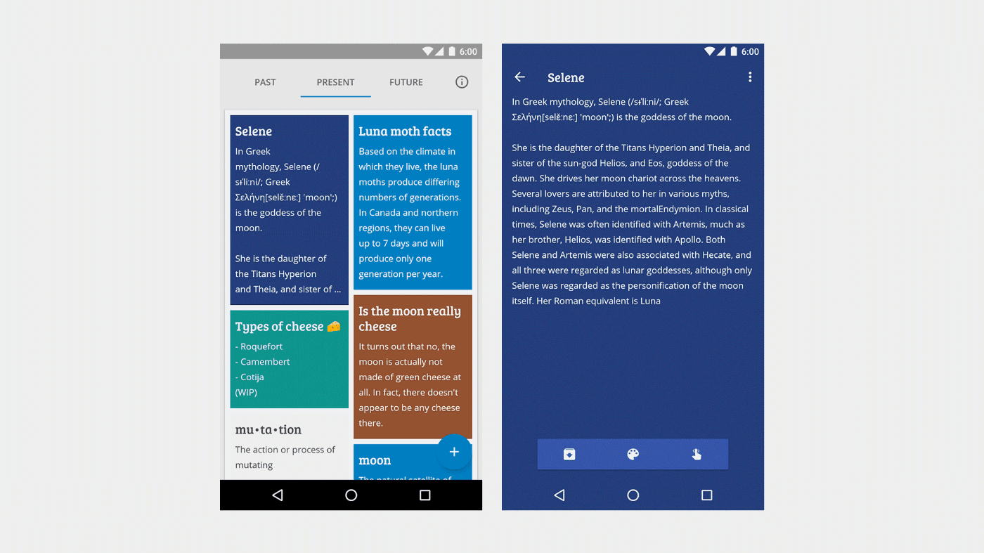
In the app, notes are able to change contrast automatically in response to changing light conditions. When Franco and I first got the feature working, I was delighted to see it in action. But after demonstrating it a few times, something clicked — the contrast was changing on the fly, constantly, in response to light conditions. We changed the intervals of change — Selene’s contrast mutation works by dividing the levels of light the phone’s sensor senses into a predetermined number of steps or intervals, which we translated to brightness and saturation values for the notes’ color palettes.
Something still felt off.
We tweaked the intervals again, and changed how the mutation is presented to the user. There were two options here, though:
We could stop the mutation from happening until the user turns their screen on and off or
The changes could continue to happen on the fly, but the mutation would happen more slowly.
The original plan only made Selene less sensitive, but these options would keep the sensitivity intact while making the mutation more palatable for the user.
We ended up going with on-the-fly transitions that were smoother and better paced. After all, it may not be natural behavior for the user to switch their device on and off while passing through changing lighting conditions.
Changes between app use
The contrast mutation is ephemeral, meaning it isn’t permanent, and only happens in short durations (on the fly as the user uses the app). Many mutations could be ephemeral, adapting to temporary realities or extra-characteristic states.
But the stronger spirit of mutative design is in lasting mutations which, immediately and over time, make the app’s interface and experience accessible and engaging for every user, no matter what their reality.
But we have to think again what it would feel like as a user to experience these longer-term mutations. As discussed before, the interface shouldn’t “pull the rug out” from underneath the user, making drastic changes that could make the app unfamiliar or uncomfortable to the user.
Striking the right balance requires a strong “mother design,” a concept discussed in the first Project Phoebe post, representing the archetypal or “pure” design of a screen, which users will likely never see.
This design establishes things like muscle memory, mental models of how the interactions work, etc. And these are pillars that we really shouldn’t mess with.
For example, we shouldn’t switch two buttons that provide distinct functions. Moving triggers for menus or other actions too far or too fast (when we must move them) should be avoided. Changing major chunks of the app’s functionality (like getting rid of a schedule sheet) shouldn’t happen. But these are practices we’ll discuss later.
Gaia: Mutation as a platform
For Selene, we intentionally chose two specific mutations to implement first, but ultimately if we’re consciously deciding as designers and developers that we know which mutations will be comfortable for every user, we have avoided the problem that mutative design looks to solve.
Our app may be mutating, but if it’s only mutating according to our own knowledge and instincts, then we are only executing a more flexible version of our existing design and development processes.
To get back on track toward solving the problem of designing for averages, we’d ideally have a framework that’s able to measure and observe mutations, centrally collecting information about mutations from apps, and informing other apps with those data.
This is a concept we’re calling Gaia.

Gaia is an idea for what would eventually be an embedded part of the operating system. Essentially, it would provide instructions for potential mutations of various UI/UX elements. But more than that, it would actually manage mutative information, receiving and distributing relative “success rates” of certain mutations, and — as it grows — speeding up successful mutations across all apps that subscribe to it.
For example, if an app implemented touch targets as mutative elements (as described in the original Phoebe post), Gaia would provide instructions for how touch targets can mutate — size, position, etc.
The app would then follow those instructions if its measurements indicate that a mutation is needed.
After mutation the app continues to measure the success rate of the user performing certain actions, and using that information, it reports back to Gaia whether the mutation was a success. If it is, Gaia can provide similar instructions to other apps for similar situations. If not, it would need to try the next set of instructions, maybe reverting back to its previous state before moving on.
Ideally, this information could be tied back to non-identifiable variables from users; their realities. This aggregated information would then be available to other apps running on the same OS on any device.
For example, Gaia could determine that for people with limited physical acuity, boosted touch sensitivity and larger touch targets are two successful mutations for buttons.
Gaia could say that for users who consistently access deep settings, shortcuts to those settings in a primary navigation area are a successful mutation to retain those users.
Gaia could determine that for young users, bolder, simpler text, brighter colors, and easily-tapped targets are successful, and that these things should change as a child user ages, easing them toward more subtle interfaces.
In this way, Gaia would allow the cycle of user feedback/analytics > design/UX changes > release > feedback/analytics to happen behind the scenes, by itself, for every user, accomplishing the real goal of a no-compromise design for everyone regardless of their reality.
Gaia + Selene
But that vision of Gaia is far into the future. So what does Gaia look like in our sample app, Selene?
Since we don’t have deep enough access to enable multi-app analysis (and we don’t actually have multiple mutative apps yet), Gaia is — for now — a class in Selene, containing instructions for exactly how to mutate different UI elements.
// makes sure it doesn't go too bright public final static float HIGH_THRESHOLD = 0.8f; // makes sure it doesn't go too dark public final static float TOLERABLE_THRESHOLD = 0.2f; public final static float LOW_THRESHOLD = 0.05f; public final static float MIN = 0.0f; /** * * @param sensor object coming from our bus containing the Ambient Light sensor value * @param mutativeObject the object that'll be mutated * @param colorToScale the current color of the mutative object * * @return a new HSV value to be applied into the object */ public static float[] computeHSV(AmbientLightSensorChange sensor, Object mutativeObject, int colorToScale) { // we divide the color into red green and blue int red = Color.red(colorToScale); int green = Color.green(colorToScale); int blue = Color.blue(colorToScale); final float hsv[] = new float[3]; Color.RGBToHSV(red, green, blue, hsv); // 'magic' algorithm float div = Float.valueOf(String.format(Locale.getDefault(), "%.2f", sensor.getLight() / ((int) SensorManager.LIGHT_OVERCAST >> 1))); if (div > HIGH_THRESHOLD) { div = HIGH_THRESHOLD; } else if (div < LOW_THRESHOLD) { div = MIN; } // Text is, by rule, in a contrasted color to the background, so we have to apply the formula backwards to the // rest of the views if (mutativeObject instanceof TextView) { hsv[2] += div; } else { hsv[2] -= div; } // making sure we don't have a weird negative value hsv[2] = Math.max(hsv[2], TOLERABLE_THRESHOLD); return hsv; }Things like text and background colors are told how to mutate in this case according to the device’s light sensor. Selene takes the top sensor value (compared to the sun shining directly on a display) and chops it up into smaller intervals, transitioning between those in real time for all the elements that subscribe to Gaia.
Designing for Gaia

In the original post about Project Phoebe, we discussed the very general concepts of designing for mutative design.
The design begins with a “mother design,” the archetypal design that many users will never see, which lays out the fundamentals of the experience, the starting point.

From the mother design, we move immediately (ideally before the user even uses the app) into a “starter state” based on ongoing realities of the user. Things like vision level, physical acuity, age, etc. are all accounted for on first run, making the experience as good as possible for the user right off the bat. In our original exploration, the user was an Adult, familiar with technology, low vision, not colorblind, with unlimited physical input and full data.

From there, smaller ongoing mutations occur, with extracharacteristic states sprinkled in between (like light level, state changes, etc).
The interface/experience can move further from or closer to the mother design depending on the user. If ongoing realities (like age) change, an interface that originally mutated for a toddler may move closer to the mother design.
But now that we’re digging deeper, what does it look like to design for something like the ephemeral contrast mutation in Selene?
The contrast mutation touches mainly color, increasing contrast between text and its canvas.
So first, we came up with the mother palette — the starting point for color-related mutations.

We optimized the text/canvas palette for contrast from the beginning, getting close to enhanced contrast as possible before any mutations occurred — the light blue canvas for example pairs with dark icons. The indigo canvasses pair with light text and icons.

Inside the app, the colors’ brightness levels are modulated automatically — the brighter the light, the darker the canvas becomes. If a canvas houses dark text, it transitions to light text seamlessly.
This may seem unintuitive, but dark backgrounds with light text actually seem to provide the best chance of proper perceived contrast in outdoor lighting.
Basically, when you look at a digital display in sunlight, every color moves closer to white. A black box will become a dark gray box. A dark grey box becomes a light gray. Light gray becomes white. White boxes stay white.
Of course this means that black text on a white background becomes grey text on a white background, grey text on a white background becomes white text on a white background, but white text on a black background becomes white text on a dark grey background. So it turns out that white is really the only immutable color on digital displays in bright light.
Thus the canvas colors in Selene get darker.
Originally this mutation took the canvas colors all the way to black. But that defeated the purpose of having the palette in the first place. The note colors are used to quickly distinguish notes from one another, so if they transition to the same color that distinction is lost.
The challenge was then not only designing a palette, but designing one that could remain distinct even as the colors migrated closer to black.

Ephemeral mutations as onboarding
The best onboarding is no onboarding — introductions to an app can become lengthy, boring, and — for existing users — annoying. Ideally users learn about the interface organically, accomplishing their tasks with minimal effort.
But mutative design, as we’ve shown with Selene, can onboard the user progressively, introducing or highlighting features only if the user needs an extra push. If the user already knows how to use the app, the app can know this automatically and remain hands-off. If there’s confusion or trouble accomplishing a task, subtle mutations can lead the user.

A simple example we’ve implemented in the app is the FAB for creating new notes. There’s data to show that floating action buttons — since the introduction of material design — have promoted and increased engagement with certain actions in apps, but to someone unfamiliar with tech or the UX patterns of Android, the simple plus icon may not be intuitive right away.
So in Selene, if the user enters the app for the first time and has no notes, and lingers on the main screen for a while, the FAB will visually morph into a full-bleed button prompting them to touch and create a new note.
In instances like this, it’s important that — visually — the user can tell where the animation comes from and what it is doing. “Meaningful motion” is, after all, a main tenet of motion in material design.
What’s interesting about this particular transformation (and transformations like it) is that it’s not happening in response to user input. Typically if the user were touching a button to make this happen, we could get away with a little less explicit motion since the action is connected in a way the user explicitly intended. But for a transformation that happens on its own, the connection must be clear.
After all, once the user has the hang of creating new notes, the FAB takes back its place in the layout, lending more room to the content area.
Dark patterns
Of course there’s the potential for evil here too, or so-called “dark patterns” of UI — it’s easy to imagine for example that a custom mutation (so, if we’re living in the future where Gaia is implemented at the OS level, a mutation that lives outside Gaia) could destroy a user’s muscle memory by for instance switching two buttons with the goal being to increase engagement on one or the other.
But as discussed above, this should be avoided. In order for mutative-design-as-onboarding to work, and indeed for the whole concept of mutative design to reach adoption, it would be necessary to define patterns and best practices. To start, we’d define these based on what we know, and then once we have more live apps, we could define them based on what we learn from users. Hopefully with the next phase of Project Phoebe we’ll begin this work.
Until then…
Until we reach consensus on initial patterns for designing and building mutative interfaces, more experimentation and research remain to be done.
Francisco Franco and I have open-sourced Selene, and made the initial beta available from the Play Store for you to try out. This post coincides with my session on mutative design at Droidcon San Francisco. I will publish the talk and slides soon.
If you’re a developer, designer, or researcher interested in the future of UIUX and mutative design, join the community, start tinkering with the code, and publish your own mutations ✨